



To make a KPI presentation with AI, upload your dataset and file to Twistly and ask the presentation maker to highlight important data and turn raw data into charts, graphs, and other visual data.
Imagine making a 15-20 slide presentation with lots of graphs, charts, and other Key Performance Indicators (KPI). Every single slide will take one or two hours, and the complete presentation can take a day or two.
When you opt for AI tools like Twistly to make a KPI presentation, slide automation offers instant and effective results in no time. How to make a KPI presentation with AI and how to use Twistly for KPI presentations? All these questions are answered in this article.
What is a KPI Presentation?
A KPI presentation is a high-level deck to show the measurable performance indicators. These indicators reflect the operational efficiency, strategic performance, and organizational success of any business. Charts, comparison tables, and other similar elements are important parts of KPI presentations.
Collecting data for these presentations is not an issue. The real challenge begins when you have to turn that raw data, collected from several sources, into a single KPI presentation. KPI presentations are used for:
- Executive reporting
- Quarterly business reviews (QBRs)
- Sales performance tracking
- Marketing analytics reporting
- Financial reporting
- Team productivity analysis
- Investor updates
An effective KPI presentation not only shows trends, but also communicates trends, opportunities, and insights that might impact your business. KPI decks are all about structured and actionable insights.
How does AI help with KPI Presentations?
Manual presentations take time and lots of resources. Turning data into charts is not easy when you must take care of designing, data inputs, and other formatting tasks. AI automates these parts and helps you get the desired slides within a few clicks.
| Benefit | Business Impact |
| Faster Slide Creation | Reduce presentation preparation time |
| Better Data Organization | Structure KPIs logically |
| Consistent Branding | Maintain professional visual identity |
| Improved Storytelling | Turn raw metrics into business narratives |
| Executive-Level Design | Create polished presentation layouts |
| Enhanced Productivity | Allow teams to focus on analysis instead of formatting |
Making a KPI Presentation with Twistly
The Twistly add-in can be installed in your existing PowerPoint software, and you don’t need to learn any tool from scratch. Here are simple steps that you need to follow to make a KPI presentation with AI, Twistly.
Create PowerPoint
Slides with AI
Build AI-powered presentations from
any prompt, doc, or video


Step 1: Prepare your Input Data
Before starting the PowerPoint presentation, you need to collect all the required data, including:
- Business summaries
- KPI metrics
- Quarterly reports
- Spreadsheet insights
- Strategic goals
A data file can be saved in your device, or you can simply prepare a document and then copy and paste data into Twistly.
Now, start a blank presentation and launch Twistly and choose whether to make a presentation from a topic, file, or text. Choose any input method based on available data.
Step 2: Pick an AI Template and Review Slide Structure
Twistly has some professionally designed AI PowerPoint templates that you can choose for your presentation and click Continue.
Twistly will generate an outline for the slides that you can review and make changes if needed. Click Continue if the slide structure is alright.
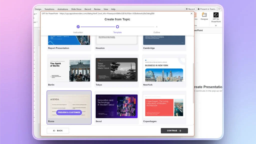
Step 3: Data Visualization Optimization
Some slides may have generic data or too much content. Executives prefer charts and other simplified data visuals. You can add:
- Smart charts
- Performance comparisons
- Trend graphs
- Progress indicators
- Heatmaps
- Forecast visualizations
Twistly will automatically add these elements to your KPI deck, but for missing parts, go to Edit Slides >> Redesign/Add Slide >> Select a Slide Layout and provide your instructions or data.
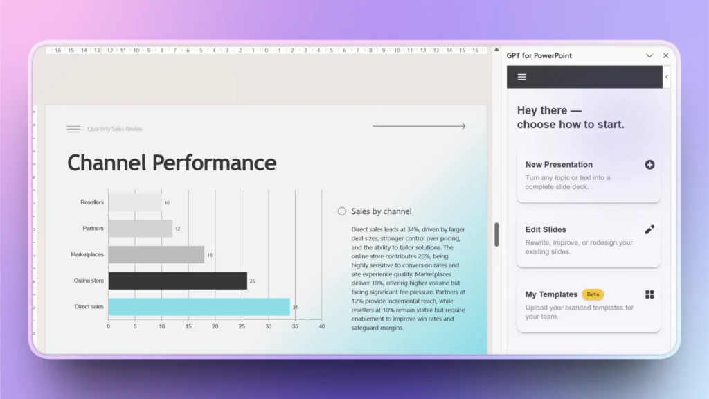
Step 4: Review your Final KPI Slides
Make sure to have tables, graphs, timelines, and data visualization optimization elements in your KPI presentation. Once all slides are done, manually review your slides before presenting.
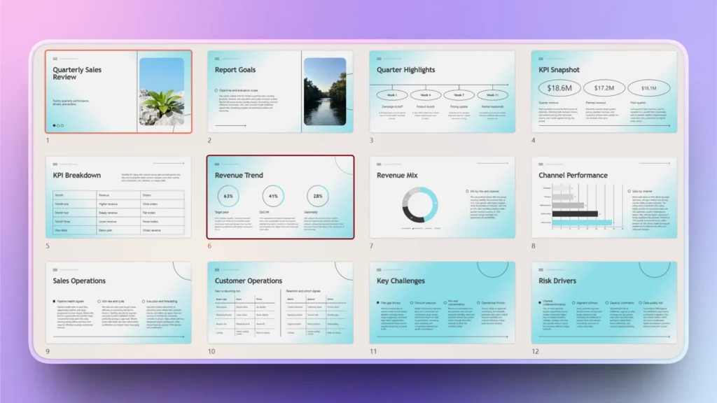
Essential Components of KPI Presentations
There are certain slides that must be in every KPI presentation. You can add as many slides as your data demands, but here are some important slides that no user can afford to miss while creating a KPI presentation with AI.
Title Slide
The opening slide can have the topic, purpose, and other details about the presentation. Keep the title slide simple and clean, but the audience should get a clear idea about the purpose of the presentation. Here is a sample title slide generated by Twistly for a simple KPI presentation.

Executive Summary
Twistly usually automatically adds an executive summary slide to most presentations. If the executive summary slide is missing, you can create one by clicking Edit Slides >> Add Slide >> Summary Slide Layout.
AI will automatically analyze the context of all slides and generate an executive summary of the entire presentation. Executives often want quick insights before diving into detailed metrics.
Charts, Trends, Comparison Tables, and KPIs
Without clear, meaningful, and attractive charts and other KPIs, your presentation is incomplete. You just need to have the raw data for the presentation. Twistly will automatically turn that data into actionable insights and charts within seconds.
Get the Ideal AI Tool for KPI Presentations
Twistly is designed to help professionals create high-quality PowerPoint presentations using AI-driven automation. You can either create a complete presentation from scratch or make individual slides by making custom inputs.
Twistly is not a slide designer but an AI assistant that automates the slide creation process for PowerPoint users. Give it a try for free by downloading the trial version. No credit card is required to use Twistly as a new user.
Create PowerPoint Slides with AI
Build AI-powered presentations from any prompt, doc, or video

Final Words
Twistly is the best tool to make a KPI presentation with AI by automating the slide creation and data visualization. From writing content to creating charts and comparison tables, everything happens within seconds, thanks to the latest AI models used in your own ChatGPT for PowerPoint.
Instead of spending hours formatting charts and structuring slides, businesses can focus on analyzing insights and driving strategic outcomes. Be smart, be more productive, choose AI, download Twistly.











Start Making AI Presentations in Seconds
Instant Access
Begin exploring Twistly’s full suite of features immediately
No Commitments
No credit card required, and you can cancel anytime
Dedicated Support
Our team is here to assist you every step of the way during your trial.