

With a little commitment, a new user can learn quite useful features of PowerPoint presentation making. We have learned how to add images, videos, GIFs, audio, and many other elements. How can we make a graph in PowerPoint? How can we represent data in visual form?
Most users don’t realize PowerPoint’s true potential. It is more than colorful slides and immersive transitions. Businesses, professionals, educators, students, marketers, and even common users make presentations with PowerPoint.
Graphs as a Visual Aid in PowerPoint
Slides need to be precise, short, and equipped with useful visual aids. Graphs help the audience understand statistics. Sales figures, department performance compared to the previous year, trends, and surveys are just a few examples of situations where graphs are best.
Steps to Make a Graph in PowerPoint
If you don’t know how to make a basic graph in PowerPoint, this detailed guide will help you. For further helpful guides about PowerPoint, visit Twistly Blog or explore your ChatGPT for PowerPoint to make presentations easily. Here are detailed steps to insert a graph in PowerPoint slides.
Step 1: Open PowerPoint
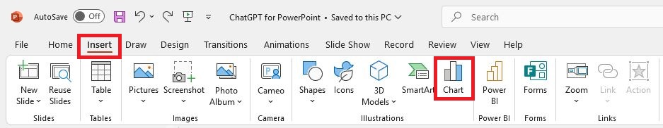
You can insert a pie graph in a new PowerPoint file or any other existing presentation. Open your new or existing presentation and select the slide where you want to add the pie graph.
Go to the Insert tab and click on the Illustrations section’s Chart icon.
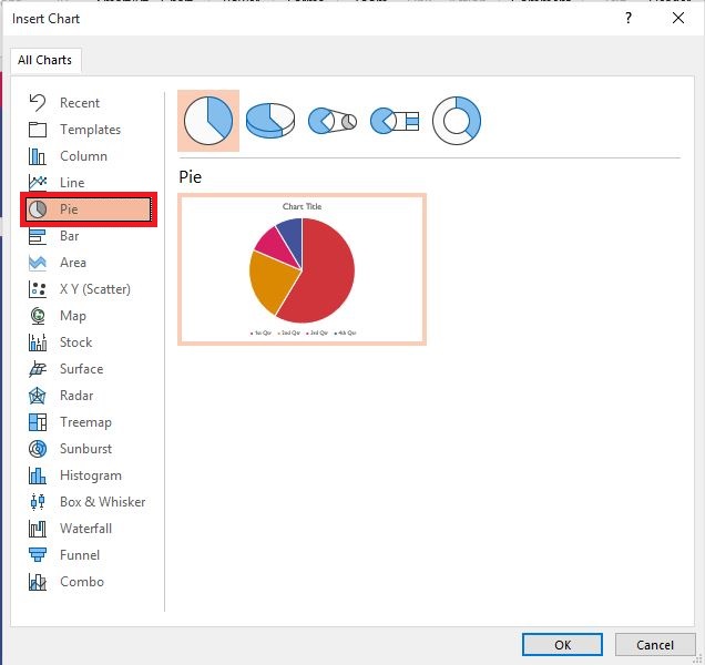
Step 2: Insert a Pie Graph
The Charts button will open a new pop-up window with different illustrations. You can add bars, charts, maps, stock, and many other visual aids for the presentation. Click on the Pie graph and select the style from the right window.
Select the pie graph style and click ok. A sample graph with random values will be added to your slide
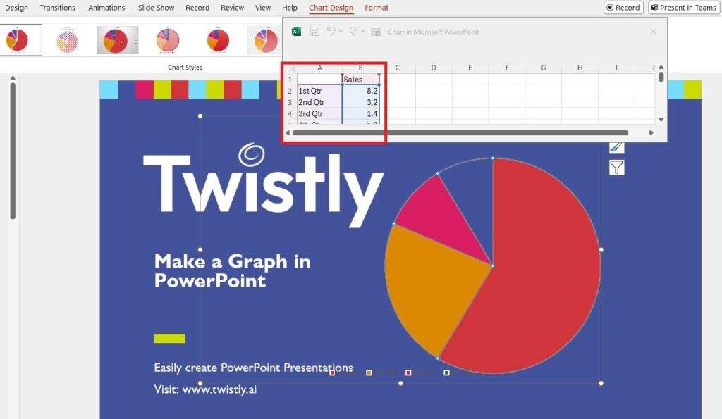
Step 3: Enter Values for Graph
Once your graph is added to the slide, a window with an Excel Sheet will appear on the screen. Here, you can add values; the graph will change according to the values entered.
Your PowerPoint presentation has a basic pie graph with dummy values. Adding a pie graph to PowerPoint was the simplest process. Follow the same method to insert charts, maps, and other elements.
Customize a Pie Graph in PowerPoint
Once you have the graph in your slides, you can customize it. Basic controls are available by clicking on the graph.
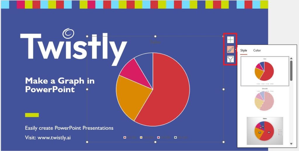
From this menu, users can edit the placeholders and values for the graph. Due to these settings, do you want to try a different style for the graph? Click on the style that you like, and changes will be applied to your graph on the slide.
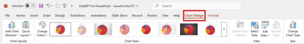
For more changes and settings related to the chart in your presentation, click on the chart and then click on the Chart Design tab from the menu. Here, you can make unlimited changes to your pie chart according to your template.
Before adding graphs and charts to your presentation, collect data and information that you want to display with graphs and charts. Adding the graph to a new dedicated slide will make reading easier for the audience. The figures and other contents of the chart should be large enough for the audience to clearly understand.
Make Slides More Attractive with AI
When you start exploring PowerPoint, you see many features and tools you never considered. Most tools are usually used by experts. For a common user, creating a simple presentation with a few slides, a nice template, and a few images can take hours.
As a corporate employee, marketer, or student, you cannot afford to spend hours creating slides daily. Why would you waste your time editing slides when AI can do everything for you in PowerPoint? Twistly is an AI-powered add-in for presentations that work as your ChatGPT for PowerPoint.
Twistly Add-in for PowerPoint
Instead of creating presentation slides from scratch, this add-in allows making presentations with AI prompts. You just have to enter the topic, and Twistly will take care of the rest. Your ChatGPT for PowerPoint can:
- Create a complete presentation on a topic
- Turn your provided text or article into a PowerPoint presentation
- Make a presentation from the provided YouTube video link
- Turn any uploaded PDF, Word, or any other document into a presentation

Twistly is fast, flexible, and easy to use for experts and new users. Download the free trial version of the AI add-in for PowerPoint now and start making awesome slides with Twistly.
Turn any Topic into PowerPoint Slides with AI.
Twistly Add-in can turn a topic into a professional presentation— Get Add-in Microsoft AppSource for free today.
Try for free
Conclusion- Make a Graph in PowerPoint
Go to Charts in the Insert tab and choose the pie option to make a graph in PowerPoint. Style your slides using available illustrations.
Charts and graphs are important parts of presentations in different niches. These elements make your slides more appealing and add value to the effective delivery of information.
Once you have added the desired chart or graph, use Twistly to optimize your slides and add AI PowerPoint templates to the presentations.
Frequently asked questions


Start Making AI Presentations in Seconds
Instant Access
Begin exploring Twistly’s full suite of features immediately
No Commitments
No credit card required, and you can cancel anytime
Dedicated Support
Our team is here to assist you every step of the way during your trial.