

In financial reporting, waterfall charts are an important visual tool. Waterfall charts are used to indicate how the initial value is affected by the positive and negative values in the data. These types of charts are used for cost breakdowns, profit analysis, revenue growth, and budget variances.
You can easily create a waterfall chart for financial reporting in PowerPoint by using the readily available chart layout. In this article, we will learn how to add a chart, edit it, and optimize it according to our project needs.
If you are tired of designing charts manually, we have an exclusive tool for you that can turn any given data into a visually appealing chart with just two clicks. So, give this complete article a read, and we promise to elevate your PowerPoint experience with AI.
Basics of a Waterfall Chart for Financial Reporting
The use of a waterfall chart is not limited to financial reporting and professional presentations, but you can also use the same tool for measuring your daily expenses and other costs.
A waterfall chart is known as a Bridge chart, too. This chart shows the cumulative effect of sequential positive and negative values. It is a visual tool to represent:
- Revenue, expenses, and net profit
- Budget vs actual performance
- Year-over-year financial changes
- Cost structure analysis
For financial reporting presentations, these charts clarify the movement of the values. You can easily detect the profit and loss contributors. Dense tables can make analysis more complicated, while waterfall or bridge charts give a clear picture at first glance.
How to Create a Waterfall Chart in PowerPoint?
You can easily insert a waterfall chart from the Insert tab, but that chart won’t work as expected when you add the real values. In this tutorial, we will insert a sample waterfall chart and then edit it for our custom values.
Step 1: Prepare your Financial Data
You need to have a structured dataset that you want to use for a waterfall chart. For this example, we will use the sample data for a project where initial capital and other costs are given. This table will be used as sample data for the waterfall chart.
| Category | Value |
| Starting Revenue | 500 |
| Sales Growth | 120 |
| Marketing Costs | -80 |
| Operating Expenses | -140 |
| Tax | -60 |
| Net Profit | 340 |
In this table, positive numbers are the gains and negative numbers indicate the losses/expenses. You can use your own actual data, as we are just using random values for this tutorial.
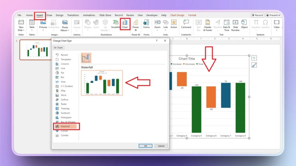
Step 2: Insert a Waterfall Chart into the Slide
Open PowerPoint and start a blank presentation. Go to the Insert tab >> Illustrations >> Chart >> Waterfall and click Ok. A sample waterfall chart with dummy values will be added to the slide as shown in the image below.
Step 3: Enter your Real Data
In the Excel pop-up, replace dummy values with your actual datasets. You can open this Excel sheet by clicking on the chart and then clicking the Edit Data option. The chart will keep updating automatically as you enter the values.
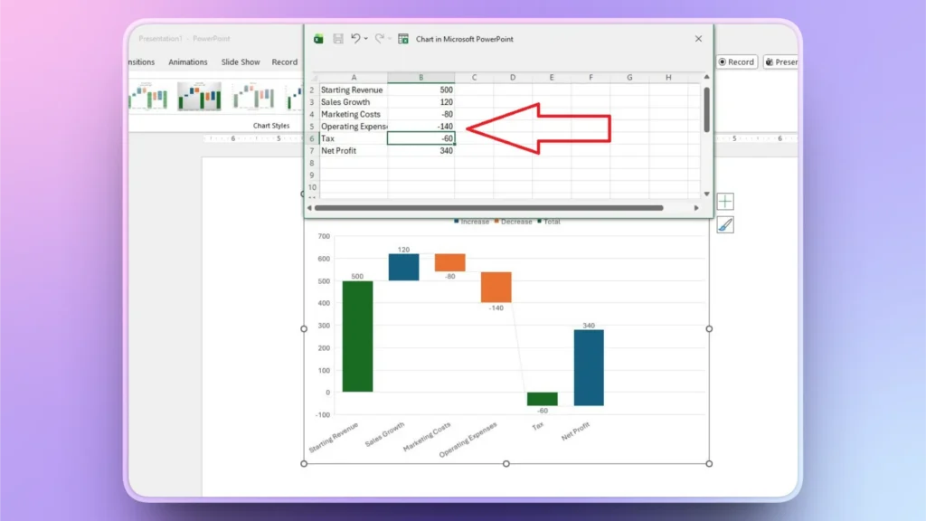
As you can see, with our real values, the chart does not look right. We will fix this issue in the next step.
Step 4: Set Total Bars
You need to define the starting and final values for the chart. In this example, we have the Starting Revenue as the initial value and the Net Profit as the final value.
Select the total bar and then right-click the bar >> click Set as Total, and you will see that the chart now looks better and more detailed.
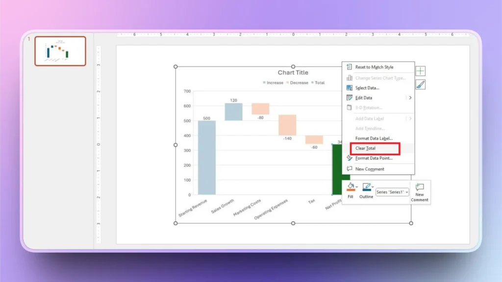
As we have already set the total, it now shows the “Clear Total” option. Previously, this option was “Set as Total.”
How to Create a Chart with AI within Seconds?
If you are still reading, it means you are eager to know how to create amazing charts and graphs in PowerPoint with AI. We have just the right AI tool for PowerPoint that will totally change your presentation experience, and the tool is called Twistly.
What is Twistly?
Twistly is an AI add-in for PowerPoint that works just like ChatGPT for PowerPoint and can generate individual slides or complete presentations from topics, AI prompts, text, and documents.
You can paste structured data, a table, or a list in Twistly, and AI will automatically turn that data into a visually appealing chart or graph. There are many slide layouts that you can choose from Twistly.
Create PowerPoint
Slides with AI
Build AI-powered presentations from
any prompt, doc, or video


Creating AI Charts with Twistly
We will go through the simple steps of creating charts in PowerPoint with AI. Make sure you have installed the Twistly add-in for PowerPoint.
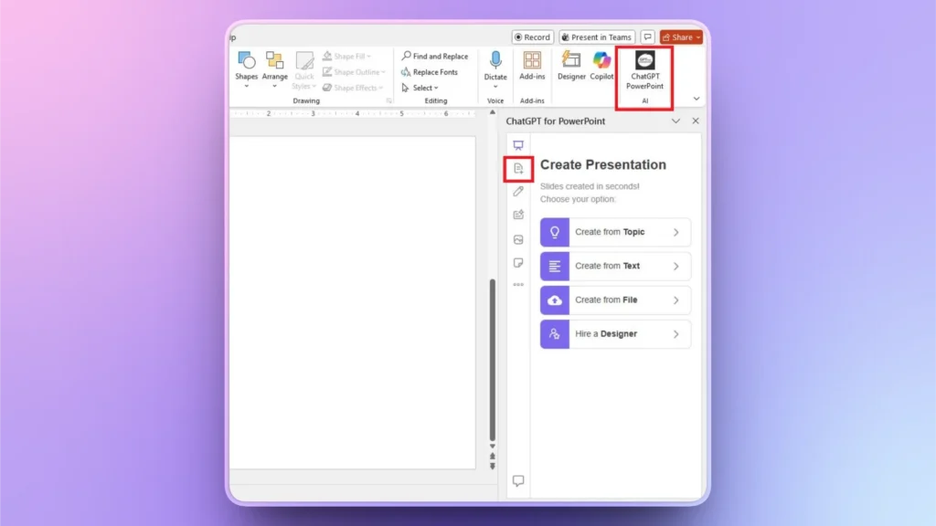
Step 1: Open PowerPoint and Launch Twistly
We are using the same presentation here that we previously used to create a waterfall chart for financial reporting in PowerPoint.
Click the Twistly icon from the top right corner and then select the second option, Add Slide, as shown in the image below.
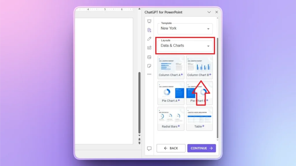
Step 2: Select Slide Layout
Select Charts and Data from the Layout menu and then select any graph or chart layout that you would like to create with AI.
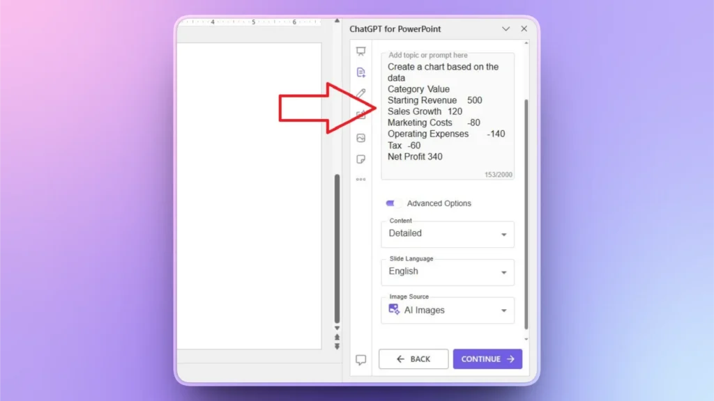
Step 3: Input your Data
In the next step, paste your structured data and explain what to do with the data. You can use plain English to explain your requirements. AI will create a chart according to the context of the data and prompts.
Step 4: Review your AI Chart
Within a few seconds, Twistly will give you a detailed chart based on your data. In the picture, you can see that the AI-generated chart is just like the waterfall chart that we previously created.
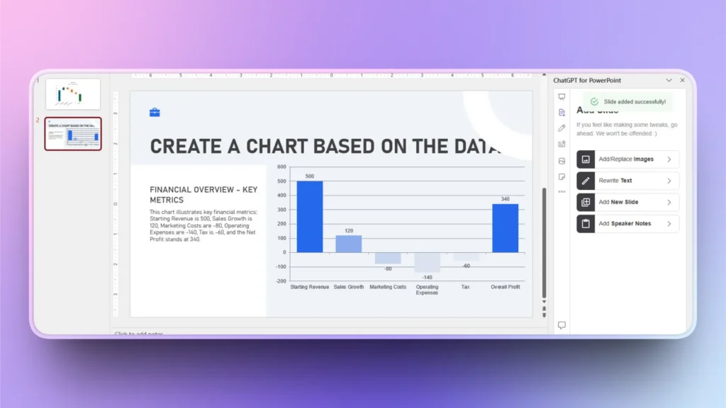
Apart from creating an accurate chart within seconds, Twistly also explained the chart in text. Twistly is way better than manual methods in every aspect.
Conclusion
You can create a waterfall chart for financial reporting with ready-made chart templates or ask Twistly to turn data into a waterfall chart with AI. We have explained both manual and automatic ways to create a waterfall chart.
If you value your time and want to save your precious time, download the free trial version of Twistly and start making complex charts with AI within seconds.
Create PowerPoint Slides with AI
Build AI-powered presentations from any prompt, doc, or video


Start Making AI Presentations in Seconds
Instant Access
Begin exploring Twistly’s full suite of features immediately
No Commitments
No credit card required, and you can cancel anytime
Dedicated Support
Our team is here to assist you every step of the way during your trial.