

To create a bar chart in PowerPoint, go to Insert >> Chart >> select Bar and then modify the chart with your custom data. This is the simplest method to insert a chart in PowerPoint, but obviously, you need more detailed steps, and that’s what we will talk about in this article.
A bar chart in PowerPoint is used to present data, trends, and numbers in a visual format. Business reports, market analysis, sales pitches, normal presentations, and academic slides, all types of PPTs can use bar charts.
What is a Bar Chart in PowerPoint?
A bar chart uses rectangular bars to visually represent data. The length of each bar represents its value. In PowerPoint, a bar chart is a built-in layout where users can edit and modify data from an Excel sheet.
When to use a Bar Chart?
Bar charts are ideal when you need to compare across multiple categories. There are multiple use cases of bar charts in PowerPoint presentations, including:
- Comparing product sales
- Showing survey results
- Presenting department performance
- Comparing quarterly revenue
- Displaying demographic data
How to Create a Bar Chart? (Step by Step Guide)
To create a detailed and customized bar chart in PowerPoint, this section offers a detailed step-by-step guide.
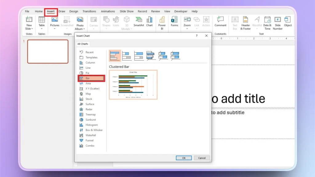
Step 1: Open PowerPoint and insert a chart.
Open your existing or new PowerPoint presentation and go to Insert >> Chart >> Bar >> click OK, and a sample Bar chart will be added to your slide.
Step 2: Enter your Custom Data
By default, a bar chart will be added with dummy data sets. You can replace the sample data with actual numbers and categories.
You need to input data on the Excel sheet shown above. If the Excel sheet is not visible, click Bar chart >> Chart Design >> Edit Data, and the Excel sheet will appear.
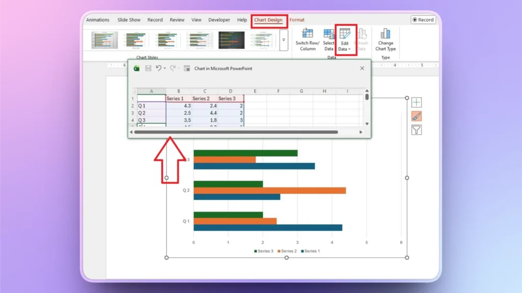
Once you have added the data, close the Excel sheet, and you will see real-time changes in the chart as you input data into the sheet.
Step 3: Customize the Bar Chart
A bar chart may look out of style compared to the overall aesthetics of your presentation. But there are several other style changes that you can make to your bar chart in PowerPoint.
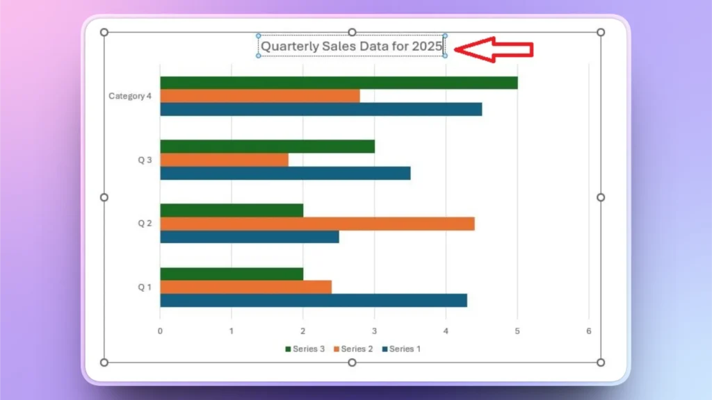
How to Change the Chart Title?
To change the bar chart title, click the sample Chart Title heading over the chart and rename it with something meaningful. A chart title should clearly define the purpose of the chart.
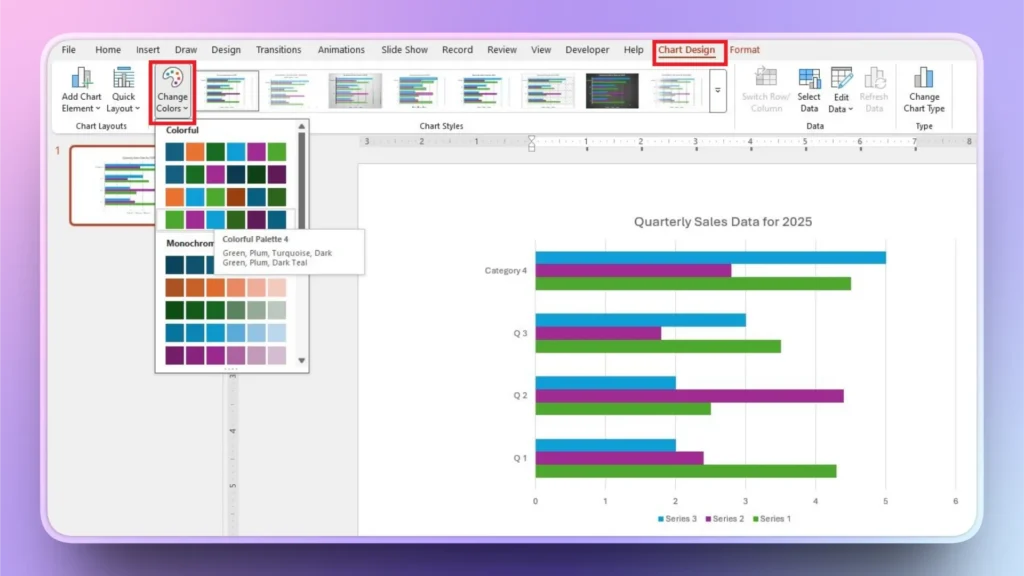
How to Adjust Bar Chart Colors?
To change or adjust bar chart colors, click the chart, go to Chart Design >> Change Colors. Pick any color palette that suits your overall presentation or brand image.
How to Change Chart Type?
To change the chart type of your existing chart, go to Chart Design >> Change Chart Type >> select new chart type. All of your data will be used to create the new chart type.
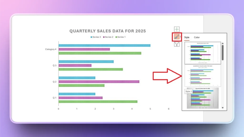
How to Change Chart Style?
Click the chart in your slide preview window and select the Style option from the three options that appear on the right side of your preview window.
From the available styles, pick any style, and it will be automatically applied to your existing bar chart in PowerPoint.
How to Create a Bar Chart in PowerPoint using AI?
Creating manual bar charts in PowerPoint takes time, but it gets complicated when:
- You have large datasets
- You need multiple slides
- You want consistent formatting
- You’re under a deadline
If you are facing any situation where you need instant results, the Twistly add-in can create professional charts using AI, where you don’t even need to design charts or input data. AI will do everything automatically.
Steps to Create a Chart with Twistly
You can create a professional bar chart in PowerPoint by writing a single AI prompt in Twistly. From finding data to designing a chart, Twistly will do everything for you.
Manual Chart Flow: Insert → Chart → Edit Data → Format → Align → Resize
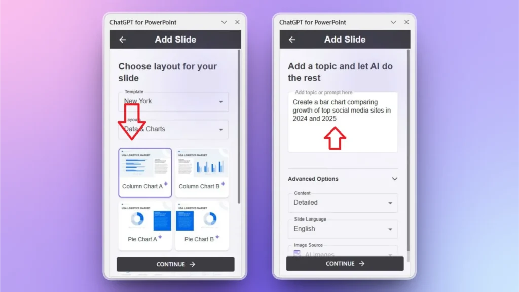
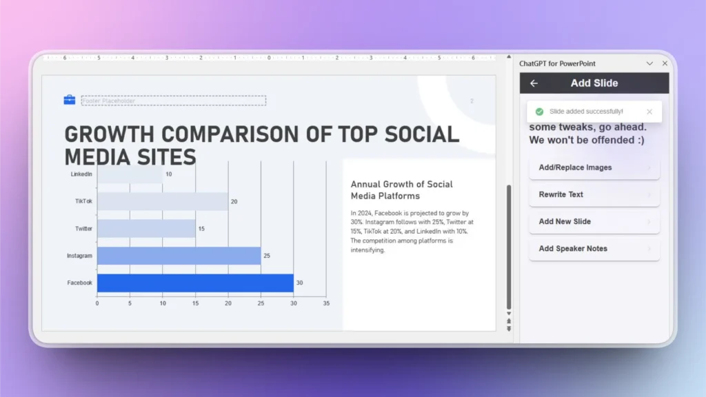
With Twistly: Create a bar chart comparing the growth of top social media sites in 2024 and 2025.
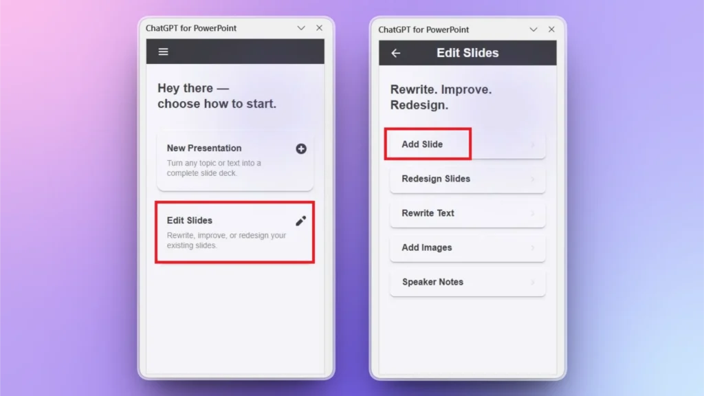
Step 1: Open PowerPoint and Twistly
Open the PowerPoint presentation where you want to add a bar chart and launch Twistly. From the Twistly window, click Edit Slides and then click Add Slide from the next window.
Step 2: Choose a Chart and Describe it
Choose a chart type from the available templates and then explain what to cover in the chart. You can use plain language, and Twistly will understand your requirements.
Step 3: Review the Final Chart
Twistly will generate a professional bar chart within seconds. As you can see in the image below, not only is the bar chart generated, but Twistly has also explained the context of the chart so users can get better ideas about the chart.
Get Twistly Free Trial Version Now
To claim a free trial version of Twistly, click the link below and get the best AI add-in for PowerPoint for free. The free version comes with limitations, but you can clearly experience the true power of a custom ChatGPT for PowerPoint.
Once you are satisfied with what Twistly has to offer for PowerPoint users, upgrade your Twistly subscription for a competitive price and save hours of precious time, and be more productive in your professional life.
Create PowerPoint
Slides with AI
Build AI-powered presentations from
any prompt, doc, or video


Final Words
Learning how to create a bar chart in PowerPoint is essential for delivering clear, data-driven presentations. The Insert tab has chart templates. Creating a bar chart in PowerPoint is easy, but modifying it takes time.
If you are not fond of spending hours creating simple charts and graphs in PowerPoint, download Twistly now and create AI charts with simple prompts. There are many other useful AI features that can improve your PowerPoint experience with AI.


Start Making AI Presentations in Seconds
Instant Access
Begin exploring Twistly’s full suite of features immediately
No Commitments
No credit card required, and you can cancel anytime
Dedicated Support
Our team is here to assist you every step of the way during your trial.