


Making charts and graphs may seem like a real challenge to many PowerPoint users. But in professional presentations, charts are quite an important part for smoother delivery of data and messages. Professionally designed charts help the audience understand complicated and raw data easily.
How to turn raw data into charts in PowerPoint and how to make instant charts with Twistly? In this article, we will explore the manual way of creating a chart in PowerPoint, and then we will discuss how AI can make your job easier.
Preparing Raw Data for the Chart
For creating a chart in PowerPoint, you need some type of data. Depending on the project, there can be any type of data, but we advise turning that data into a table so that understanding the information will be easier for you.
For this example, we will use this sample data to create a chart in PowerPoint. For the first method, we will use the conventional way of creating charts in PowerPoint.
| Slide Type | Engagement (%) |
| Text-heavy | 35 |
| Visual | 70 |
| Data-driven | 60 |
| Interactive | 85 |
Method 1: Creating a PowerPoint Chart Manually
Inserting a tab in the top ribbon allows users to insert charts and graphs into slides. From selecting the appropriate chart to inserting data into the chart, this process is going to be lengthy.
In this section, we will give you an overview of inserting charts manually, but our focus will be on using Twistly for charts. We will talk about Twistly in the next sections.
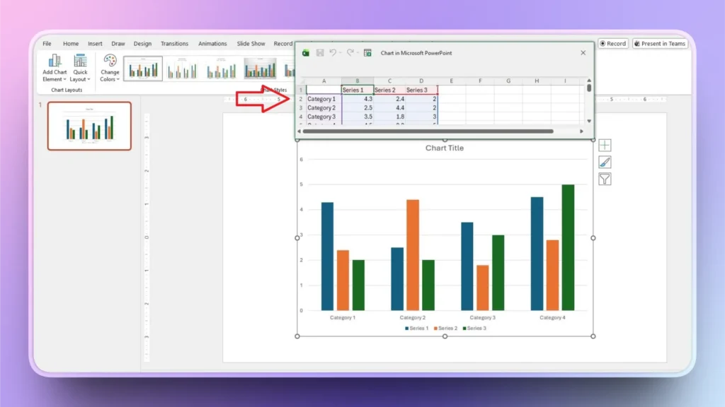
Step 1: Insert the Chart into the Slide
Open the PowerPoint slide and then go to the Insert tab in the top ribbon. Click the Chart and then choose any type of chart that you want to add to the slide.

Step 2: Input Data into the Chart
Once you have inserted the chart into the slide, an Excel sheet will appear on the slide. Now, enter the values in the Excel sheet, and the PowerPoint chart will change accordingly.
Entering values into the sheet and then designing the chart can easily take significant time. This may look simple, but handling large amounts of raw data can be daunting.
Method 2: Turn Data into a PowerPoint Chart with Twistly
Now comes the easiest method of creating charts in PowerPoint. Twistly has a smarter solution to all of your PowerPoint project needs. Whether you need to add a timeline, table, chart, or any other element, Twistly can do it within seconds.
Adding charts to PowerPoint slides with Twistly is easy because you don’t have to handle the designing part or any other editing steps. All you have to do is select the slide layout, paste data in natural language, and Twistly will take care of the rest.
Follow these given steps to learn how to turn raw data into charts in PowerPoint with the help of Twistly.
Step 1: Open PowerPoint and Twistly
Start a blank PowerPoint presentation or open an existing PPT and then launch Twistly. Click the ” Add Slide option from the menu.
Step 2: Select Slide Layout and Template
By default, Twistly shows all available slide layouts. But we need to add a chart to the slide, so we will select Charts and Tables from the Layout menu. You can also change the template according to your needs.
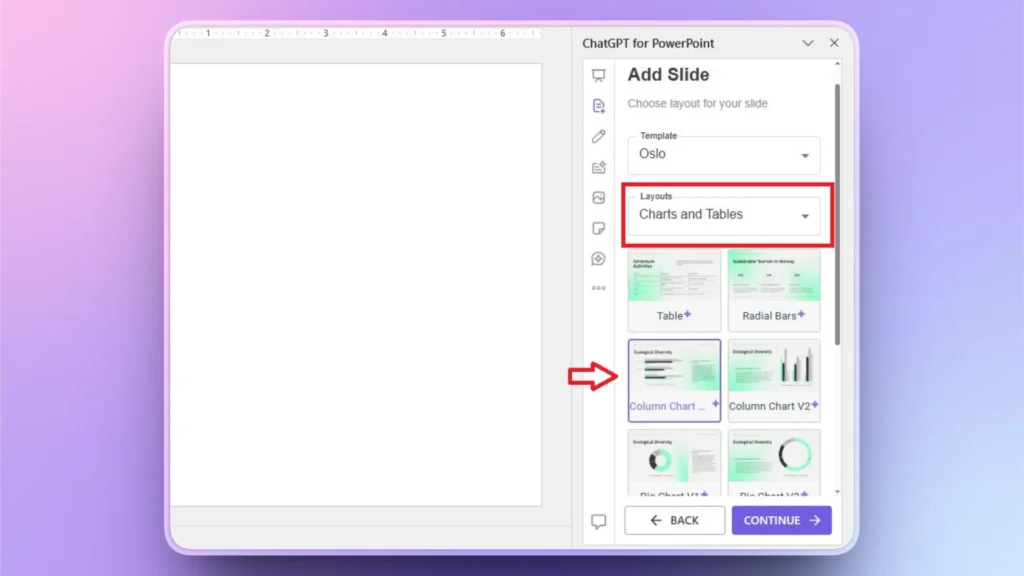
Now, select any layout that you want for your PowerPoint chart and click Continue.
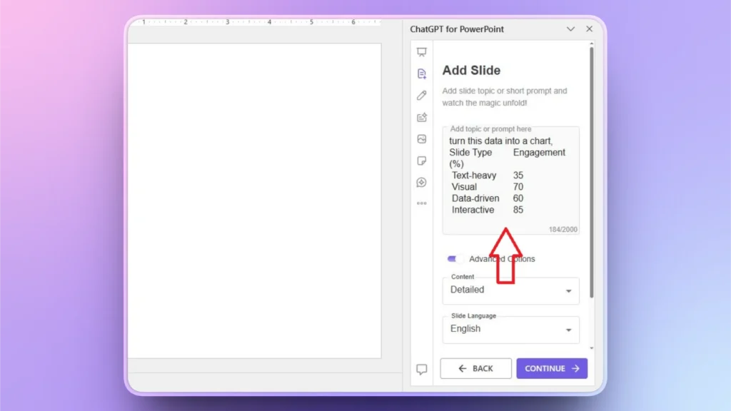
Step 3: Input your Raw Data
On the next step, paste your raw data into the text box and then make additional choices if needed. After inputting the data, press Continue.
Step 4: Your AI PowerPoint Chart is Ready
Within a few seconds after providing the data, Twistly will turn that table into an interactive chart that you can edit manually or with Twistly AI features.
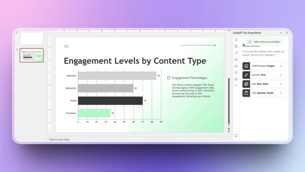
As you can see, this whole process does not take more than a minute, and you get a professional PowerPoint chart without any manual editing or formatting. Twistly managed data, design, and other steps automatically.
Benefits of Using Twistly to Create Charts
Twistly is not only for beginners, but even professional users rely on Twistly for creating interactive charts and slides. As compared to manual methods and conventional charts, data visualization is way easier and attractive with Twistly AI features.
Here are some practical benefits of using Twistly for creating charts with AI for classroom projects and other types of presentations.
- Twistly converts raw data into charts automatically, saving time and manual editing efforts.
- The AI analyzes your data and suggests the most suitable chart type
- Twistly works directly inside PowerPoint, allowing you to create, edit, and refine charts
- Even users with no data visualization or design experience can create charts
- Charts automatically align with your slide theme
- Twistly accelerates the entire process from raw numbers to presentation-ready visuals.
- Twistly helps presenters focus more on insights and messaging rather than formatting.
Download your Own ChatGPT for PowerPoint
If you are tired of spending hours creating simple charts in PowerPoint, use Twistly to turn raw data into charts in PowerPoint. Apart from charts and graphs and individual slides, Twistly can generate complete presentations within seconds.
Twistly is a paid and premium add-in, but for new users, a free trial version is available. Users can try the free version without a credit card or financial commitment.
The higher level of user satisfaction has made Twistly the highest rated add-in on Microsoft AppSource. Use the link below to claim your free trial version of the custom ChatGPT for PowerPoint, Twistly add-in.
Create PowerPoint Slides with AI
Build AI-powered presentations from any prompt, doc, or video

Final Words
Turning raw data into charts in PowerPoint is a straightforward process with Twistly. We have explained both methods. When done well, charts turn raw data into compelling stories that your audience can instantly understand.


Start Making AI Presentations in Seconds
Instant Access
Begin exploring Twistly’s full suite of features immediately
No Commitments
No credit card required, and you can cancel anytime
Dedicated Support
Our team is here to assist you every step of the way during your trial.