


If you’ve ever been asked to “just throw together an org chart” for a meeting, you know it’s never quite as quick as it sounds. The good news is PowerPoint actually has some pretty solid tools for building organizational charts… no fancy design software required.
Whether you’re mapping out a small team or a sprawling corporate hierarchy, you can make something clear, neat and professional without spending your whole afternoon fighting with shapes. Let’s walk through how to create an org chart in PowerPoint, step-by-step, but in a way that doesn’t feel like you’re reading an instruction manual.
What to Do First…
Before you even open PowerPoint, grab a piece of paper or a Word doc and jot down the structure. Start with the top role, then list who reports to them and keep branching down.
This saves you from the classic “Wait, where does Sarah fit in again?” problem halfway through building your chart. Plus, you’ll avoid having to reshuffle everything because someone forgot to mention a whole department.
Using PowerPoint SmartArt for Your Org Chart
Once you’ve got your hierarchy sketched, fire up PowerPoint and open a blank slide.
You don’t need a template yet… just a clean space to work in. Head to the Insert tab at the top, click SmartArt and you’ll see a window pop up with a bunch of diagram options.
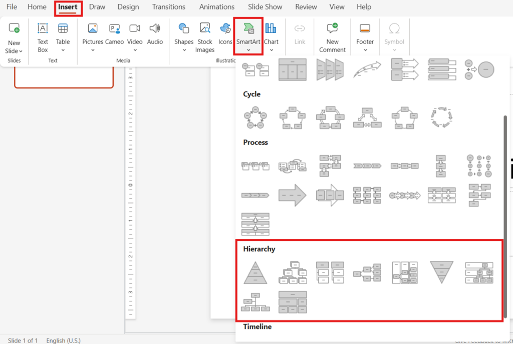
Look under Hierarchy. This is where PowerPoint hides all its org chart layouts. There’s the classic “Organization Chart” option, but there are also more styles if you want something different.
Adding People to Your Org Chart
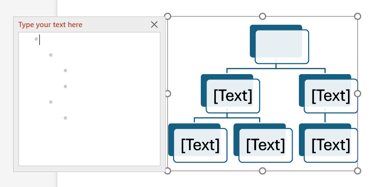
Click the layout you want and hit OK. You’ll see a basic chart drop into your slide with placeholder text.
To edit, just click into each box and type the name and job title. Keep it consistent… either “Name, Title” or “Title – Name,” but don’t mix them.
Note: When using PowerPoint in your browser, you will have to edit the text boxes using the “Type your text here” editor box that appears (see image below).
Need to add someone? Right-click the box that person will report to, choose Add Shape, and pick from options like:
- Add Shape Below – adds a direct report
- Add Shape Above – inserts a manager level
- Add Shape After – puts someone at the same level
Note: PowerPoint online once again does this differently, requiring you to add and/or reorganize the bullet points in the editor box to add fields.
[More from Twistly: Learn How to Link to Other Slides Within Your PowerPoint Presentation]
Designing Your Org Chart
Here’s where you can make your chart look polished without spending an hour fussing over colors and lines. While your chart is selected, you’ll see SmartArt Design and Format tabs appear. Under Design, check out the Change Colors menu. PowerPoint gives you pre-set color schemes that keep things readable.
Stick to simple colors like blue, gray or a muted gradient. In some cases, it might be appropriate to use your brand colors.
Under the Format tab, you’ll find other options, like the ability to change WordArt Styles. While this might be helpful for some, we recommend being cautious with this. You don’t want to get too crazy, unless you’re confident in your design skills. Simple is best with this kind of thing.
You can also change the layout here if you realize the style you picked at the start doesn’t work with the number of people you have.
Here are a few more tips to consider as you’re building out your chart:
- Short names fit better. If someone has a long title, try abbreviating (VP instead of Vice President) so it doesn’t blow up the box size.
- Pictures work… sometimes. You can add photos for a personal touch, but it can make the chart look busy if you have more than 10 people.
- Keep the font consistent. Changing fonts mid-chart is the easiest way to make it look messy.
Create PowerPoint
Slides with AI
Build AI-powered presentations from
any prompt, doc, or video


What If You Have Too Many People?
If your org chart has more than, say, 20 names, it’s going to get crowded fast. That can make things difficult, but there is a solution.
One fix is to simply break things up. Create one slide for the top leadership, then separate slides for each department. That way, you can zoom in on each section without squinting to read names.
If this chart is something the team will update regularly, save the file somewhere shared, like OneDrive or SharePoint, and make sure everyone knows how to use it. If you do separate your org chart into multiple slides, it’s a good idea to make sure everyone understands how it’s organized.
You might also consider saving your PowerPoint as a PDF file. That’s fine for a final copy, but keep a PowerPoint version editable for next time someone changes jobs or a new hire comes in. You don’t want to be stuck recreating this.
Is PowerPoint the Best Tool for Making Your Org Chart?
Now, you might be asking, is PowerPoint really the best tool for creating an org chart. Would it be better to use an Excel sheet or a Word doc? You can, but PowerPoint gives you a lot of control over layout and style while keeping it easy to present. If your org chart needs to be part of a bigger presentation, you can drop it right in without having to switch apps.
Making an org chart in PowerPoint doesn’t have to be a frustrating chore. The trick is to plan it out before you start, use SmartArt for the heavy lifting and keep things clean and simple.
And remember, an org chart isn’t just a pretty diagram. It’s a tool for helping people understand how your organization works. A good one can save time and avoid confusion.


Start Making AI Presentations in Seconds
Instant Access
Begin exploring Twistly’s full suite of features immediately
No Commitments
No credit card required, and you can cancel anytime
Dedicated Support
Our team is here to assist you every step of the way during your trial.