

Los usuarios de PowerPoint pueden sentirse decepcionados al saber que la sección SmartArt no tiene un diagrama de espina de pescado dedicado. No se puede editar una plantilla existente para crear un diagrama de espina de pescado en PowerPoint.
Diagrama de espina de pescado, Ishikawa o diagrama de causa y efecto son los nombres del mismo elemento visual. Este diagrama lo utilizan profesionales de muchos sectores para identificar, organizar y analizar las causas profundas de los problemas.
En este artículo, aprenderemos a crear un diagrama de espina de pescado en PowerPoint. Podrás reforzar tus diapositivas para presentaciones de análisis de negocio, gestión de proyectos y gestión de calidad.
¿Qué es un diagrama de espina de pescado en PowerPoint?
Como su nombre indica, un diagrama de espina de pescado se parece al esqueleto de un pez y representa visualmente un problema y sus posibles causas.
Antes de aprender a crear un diagrama de espina de pescado en PowerPoint, es necesario comprender la estructura básica del diagrama de espina de pescado para presentaciones de PowerPoint:
- Cabeza → El problema o efecto
- Columna vertebral → La línea principal que conecta las causas con el problema
- Huesos → Categorías de causas
- Sub-bones → Factores contribuyentes específicos
El uso de este tipo de diagramas creativos añade valor y detalles a sus diapositivas. En función de la presentación, los usuarios pueden modificar las categorías y otros aspectos del diagrama.
Creación de un diagrama de espina de pescado en PowerPoint
Hay diferentes maneras de añadir un diagrama de espina de pescado a su presentación de PowerPoint, pero primero empezaremos con el método manual. En este método, crearemos un diagrama de espina de pescado desde cero. Siga estos pasos y haga cambios en el contenido según sea necesario.
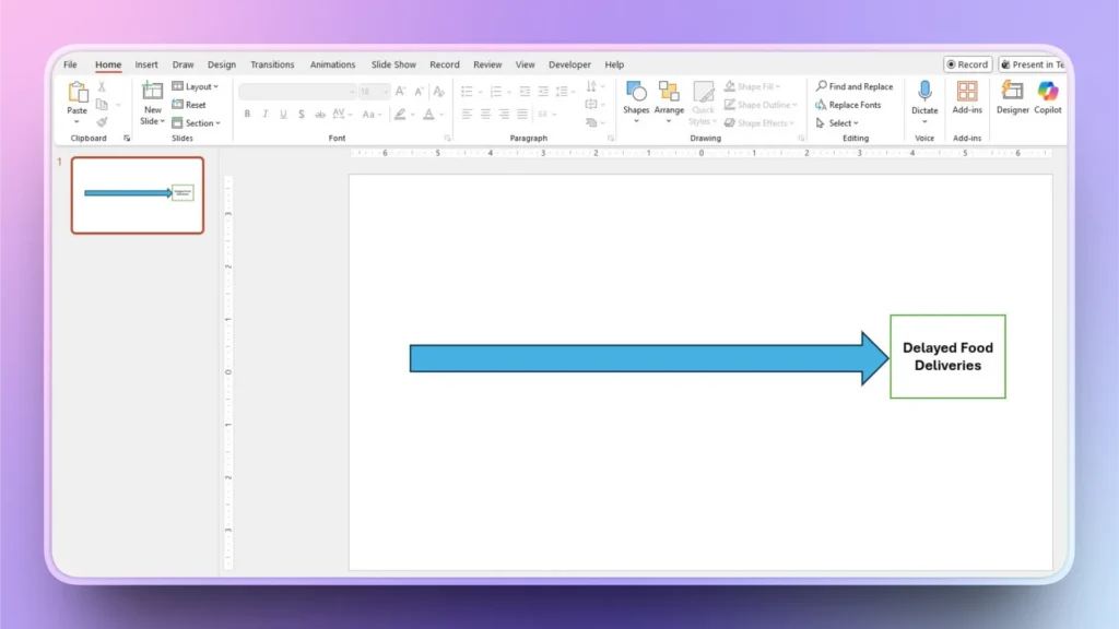
Paso 1: Dibujar la forma principal
Abra PowerPoint e inicie una presentación en blanco. En la diapositiva en blanco, vaya a Insertar >> Formas >> Flecha y dibuja una línea horizontal en la diapositiva. Esta flecha representa el problema principal.
Dibuja un rectángulo en el extremo derecho de la columna vertebral e introduce el enunciado del problema en la cabeza/rectángulo.
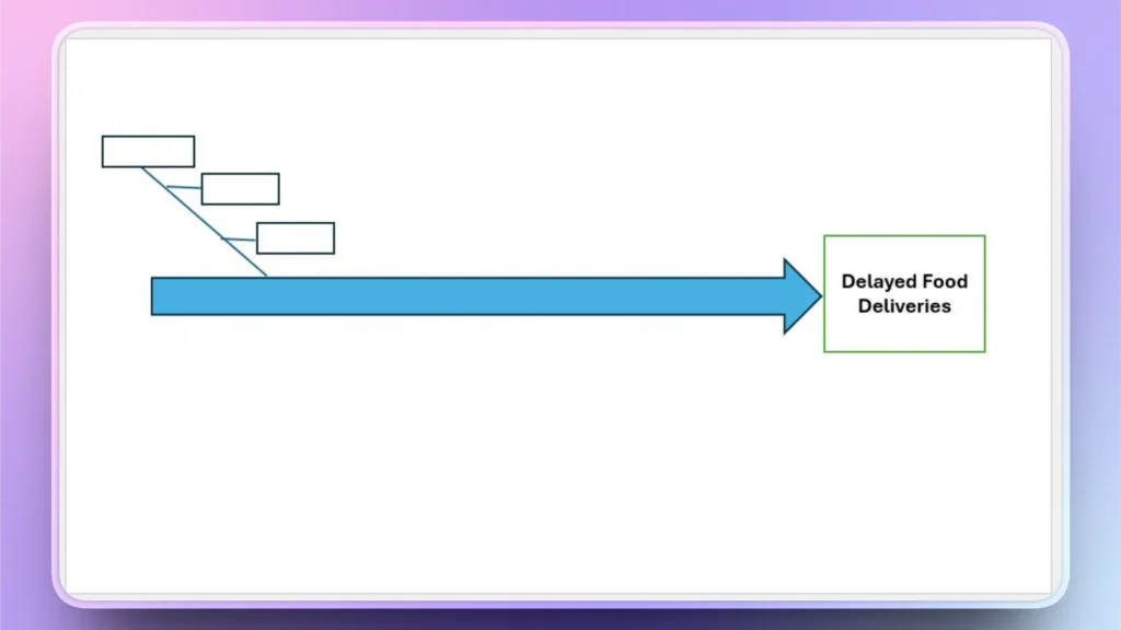
Paso 2: Añadir costillas a la columna vertebral
Dibuje líneas diagonales como costillas, y estas líneas son las líneas de causa. Dibujaremos una línea diagonal al principio y luego añadiremos sub-causas a la línea como se muestra en la imagen.
Ir a Insertar >> Dibujar una línea diagonal>> Añadir rectángulos y luego conecta los rectángulos con la línea diagonal con líneas horizontales. Obtendrás una forma como esta.
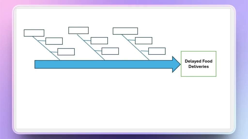
Paso 3: Añadir costillas en la parte superior de la columna vertebral
Copie la primera línea diagonal y los cuadros de texto como se muestra en el paso 2 y pegue la misma estructura para crear copias según las necesidades de su proyecto. Obtendrá más estructura como esta imagen.
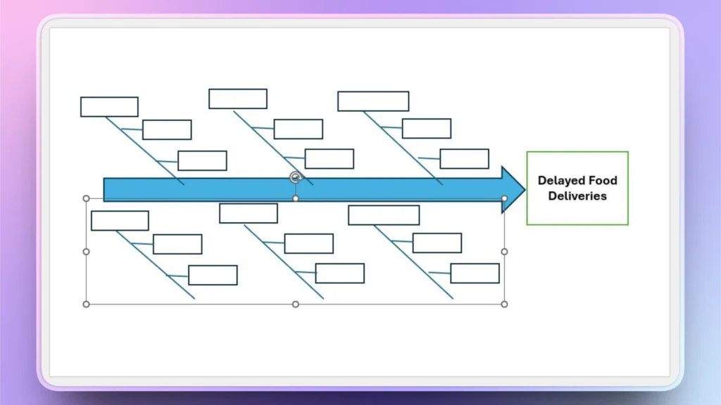
Paso 4: Agrupar todas las costillas y dar la vuelta a los elementos agrupados
Seleccione las líneas diagonales, los cuadros de texto y las causas principales, y vaya a Formato de la forma >> Agrupar y, a continuación, agrupar todos los elementos seleccionados. Asegúrese de que las líneas diagonales también están seleccionadas para la agrupación.
Ahora, copia el grupo y pégalo. Obtendrás una estructura que no parece correcta.
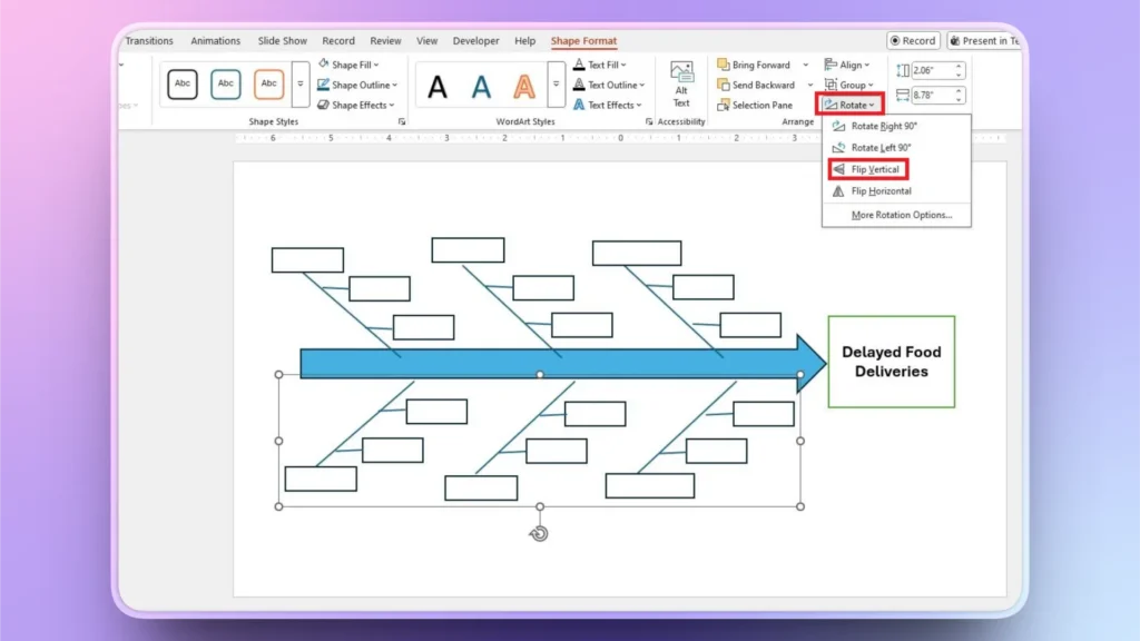
Seleccione el grupo pegado y vaya a Formato de la forma >> Rotar >> Voltear vertical, y ahora la estructura parece completa y correcta como se muestra en la imagen de abajo.
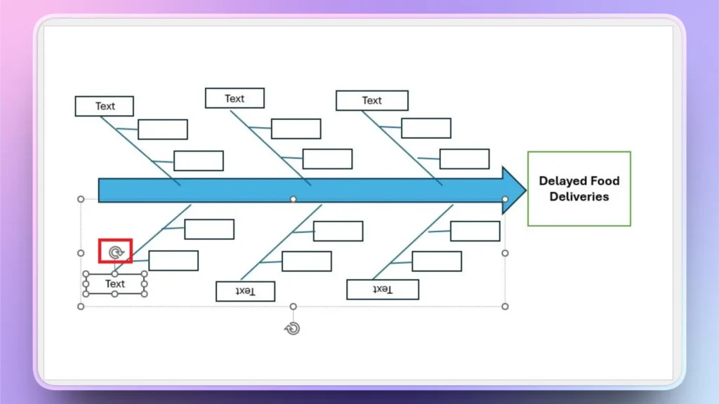
Paso 5: Añadir texto y rotar el texto de la costilla inferior
Introduce texto en las casillas según las necesidades de tu proyecto. Pero hay un problema. El texto de la costilla inferior está invertido.
Una vez añadido el texto, selecciónelo y utilice los controles situados junto al cuadro de texto para girarlo 180 grados y facilitar su lectura.
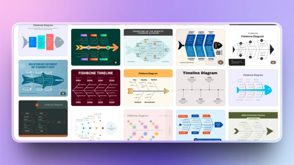
Método alternativo: Utilizar plantillas de diagramas de espina de pescado
Los profesionales prefieren hacer diseños y diagramas únicos y novedosos para mantener la identidad de la marca. Si no eres una persona experta en tecnología y quieres una forma más fácil de crear un diagrama de espina de pescado en PowerPoint, puedes visitar las tiendas online para encontrar plantillas de diagramas de espina de pescado fácilmente disponibles.
Una vez que haya encontrado la plantilla de diagrama adecuada, descárguela y ábrala para editar la plantilla con contenido personalizado. Editar una plantilla es más fácil que crear un diagrama desde cero.
Nota: Existen algunos problemas y limitaciones con las plantillas de espina de pescado que están disponibles de forma gratuita. Estos diagramas vienen con marcas de agua u ofrecen opciones de personalización limitadas. Las plantillas premium cuestan dinero pero ofrecen una mejor experiencia y flexibilidad.
¿Cómo utilizar la IA para la visualización de datos en PowerPoint?
Añadir y editar una presentación para una mejor visualización de los datos es difícil. Las personas con experiencia también tardan horas en crear líneas de tiempo y gráficos visualmente atractivos y detallados para las presentaciones de PowerPoint.
¿Quieres saber más sobre una herramienta de IA que puede añadir elementos avanzados de visualización de datos a las diapositivas con simples clics?
Prueba Twistly para PowerPoint, un ChatGPT personalizado para presentaciones, en el que puedes utilizar diseños de diapositivas ya disponibles y luego personalizarlos con indicaciones de AI.
Crear PowerPoint
Diapositivas con IA
Cree presentaciones basadas en IA a partir de
cualquier mensaje, documento o vídeo


¿Cómo utilizar Twistly para la visualización de datos?
El proceso de utilización de Twistly es sencillo. Una vez descargado e instalado el complemento Twistly para PowerPoint, basta con hacer clic en el icono ChatGPT para PowerPoint y aparecerá una ventana específica en la parte derecha de la pantalla.
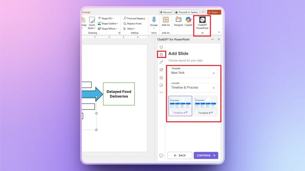
Paso 1: Añadir una diapositiva personalizada
Haga clic en el botón ”Añadir diapositiva" del panel de control de Twistly y seleccione una plantilla y un tipo de diseño. Puede elegir cualquier diseño de diapositiva que desee añadir a la presentación.
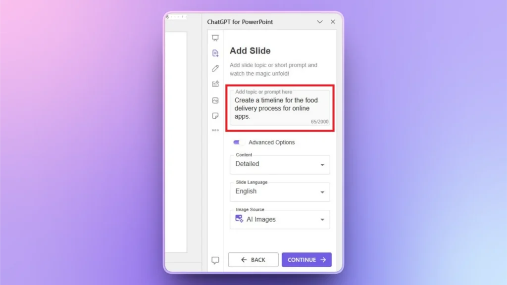
Paso 2: Explique su calendario
Explica qué se va a tratar en la línea de tiempo o de qué trata. Puedes usar un inglés sencillo para explicar tu idea y luego también hacer más cambios si es necesario.
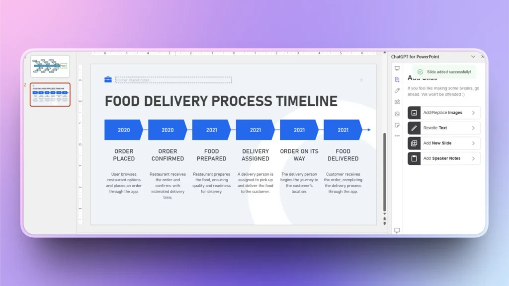
Paso 3: Su nueva diapositiva está lista
En sólo unos segundos, Twistly generará una línea de tiempo totalmente editable y detallada en una nueva diapositiva. Puede utilizar las funciones de IA de Twistly o las herramientas nativas de PowerPoint para ediciones posteriores.
Palabras finales
Puede crear un diagrama de espina de pescado en PowerPoint utilizando líneas y rectángulos sencillos para explicar el problema principal y sus causas. El proceso es largo pero fácil de seguir. Para otros elementos de visualización de datos, utiliza Twistly y añade diapositivas con unos pocos clics, gracias a la IA.


Empieza a hacer presentaciones con IA en segundos
Acceso instantáneo
Empieza a explorar inmediatamente todas las funciones de Twistly
Sin compromisos
No necesita tarjeta de crédito y puede cancelar en cualquier momento
Asistencia dedicada
Nuestro equipo está aquí para ayudarle en cada paso del camino durante su juicio.