

Diseñar presentaciones accesibles garantiza que su mensaje llegue a todos los asistentes. No hay que dejar de lado a las personas con necesidades especiales, incluidas las que padecen dislexia. Las presentaciones accesibles contribuyen a una mayor participación y fomentan la inclusión.
Todos los cambios que hacen que una presentación sea más accesible y legible para las personas disléxicas también mejoran la legibilidad para el público en general.
En este artículo, exploraremos algunas de las fuentes más populares aptas para disléxicos. Al final de esta guía, dispondrás de todos los recursos para diseñar presentaciones accesibles para un público diverso.
Importancia de las fuentes adaptadas a la dislexia
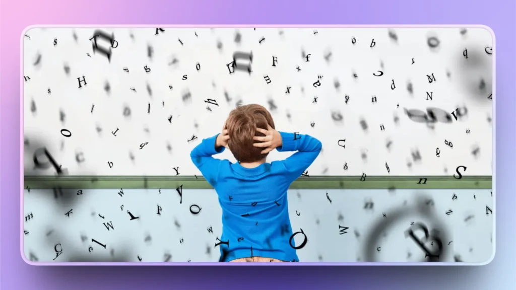
La dislexia es una diferencia de aprendizaje común basada en el lenguaje que afecta a la capacidad de procesar textos con fluidez. No es una enfermedad ni está relacionada con la inteligencia. Unos pocos cambios de diseño y unas fuentes adaptadas a la dislexia pueden marcar una gran diferencia.
Ciertas formas de letras y espaciado pueden parecer abarrotados para las personas disléxicas, y éstas podrían malinterpretar el texto. Familias de fuentes como Times New Roman y sans-serif pueden parecer borrosas para estas personas.
Algunos tipos de letra funcionan mejor para las personas con dislexia. Estas fuentes están pensadas para:
- Mejorar la distinción de letras
- Reducir la aglomeración visual
- Lectura más fluida
- Reducir la tensión
- Hacer las presentaciones más accesibles
En las presentaciones habituales, no solemos fijarnos en las familias de fuentes. Pero para las personas con necesidades especiales, algunos cambios de diseño hacen que tus diapositivas sean más accesibles para todos.
Recomendaciones de fuentes para disléxicos
Utilizar un tipo de letra apto para disléxicos no es la única solución para que sus presentaciones sean más accesibles, pero esta pequeña decisión de diseño puede marcar una gran diferencia. Al elegir un tipo de letra para disléxicos, asegúrate de que tenga ciertas características, como:
- Formas de letras distintivas
- Formas sencillas y abiertas
- Espaciado generoso
- Ancho de trazo uniforme
Como recomienda el equipo de soporte de Microsoft, utilice fuentes con un espaciado generoso entre las letras y un tamaño de fuente de al menos 18 puntos. Calibri, Lucida Sans, Segoe UI y Franklin Gothic Book son algunos tipos de letra habituales que funcionan bien como fuentes aptas para disléxicos en presentaciones de PowerPoint.
Ninguna fuente o tamaño puede garantizar una accesibilidad perfecta para las personas disléxicas, pero algunas fuentes funcionan mejor que otras. Aquí tienes algunas fuentes aptas para disléxicos que quizá quieras añadir a tus próximas presentaciones.
| Fuente | Explicación |
| Disléxico abierto | Estas fuentes tienen fondos pesados para anclar el texto y formas de letras distintas que reducen la confusión. Este tipo de letra está especialmente diseñado para personas con dislexia. |
| Arial | Una fuente sans-serif limpia está ampliamente disponible y es fácil de leer cuando se utiliza con el espaciado adecuado. No es específica para la dislexia, pero es fiable. |
| Verdana | El generoso espaciado y los grandes contadores hacen de Verdana uno de los tipos de letra aptos para disléxicos. |
| Tahoma | Ofrece formas abiertas y un buen espaciado, lo que mejora la legibilidad. |
| Helvética | Se trata de fuentes muy utilizadas y, con un mayor espaciado, funcionan bien como fuentes adaptadas a la dislexia. |
¿Cómo hacer más accesibles las presentaciones?
Elegir la familia tipográfica adecuada para personas disléxicas es uno de los muchos pasos que hay que dar para que las presentaciones sean más accesibles. Hay muchos otros elementos de diseño que puedes mejorar para llegar a un público más amplio.
En los megaeventos e internacionales, la accesibilidad de la presentación es lo más importante. He aquí otros posibles aspectos de una presentación que pueden hacer que su presentación sea más accesible para todos.
Texto
Deje espacio en las diapositivas para que el público pueda leer y procesar el texto con facilidad. Utiliza un máximo de 7 líneas en cada diapositiva y limita a 6 el número de palabras por diapositiva. Dejar suficiente espacio por debajo y por encima de cada línea facilitará la lectura del texto a distancia.
Notas del orador
Los presentadores no tienen por qué añadir todos los detalles y datos a las diapositivas. Las notas del orador son una gran herramienta para reducir el desorden al tiempo que proporcionan temas de conversación.
Las notas del orador se añaden al pie de la diapositiva para que los datos de las notas del orador no afecten a la legibilidad de las diapositivas para el público.
Maquetación y diseño
El diseño de diapositivas no sólo tiene que ver con el valor estético y el atractivo visual, sino también con hacer que su contenido sea más accesible para un público más amplio. Al elegir un diseño o una plantilla para tu próxima presentación, céntrate en ciertos aspectos que pueden aumentar la legibilidad del texto y otros elementos.
| Fondo | El fondo blanco dificulta la lectura del texto. Utiliza un fondo blanco roto o crema para las diapositivas para mejorar la legibilidad, y usa un color de texto oscuro con mucho espacio entre las palabras. |
| Imágenes | Añade imágenes a las diapositivas que faciliten al público el procesamiento de la idea. No olvides utilizar el texto alternativo para las imágenes de las diapositivas. |
| Diseño | Las imágenes, el texto y los diseños coloridos y gráficos funcionan mejor para las personas disléxicas. |
¿Cómo mejorar la accesibilidad de las presentaciones con IA?
Las herramientas de IA como Twistly están desarrolladas para mejorar su presentación general de PowerPoint, incluida la accesibilidad de las diapositivas. Twistly es una completa suite de IA para usuarios de PowerPoint que puede generar nuevas presentaciones desde cero o mejorar las ya existentes.
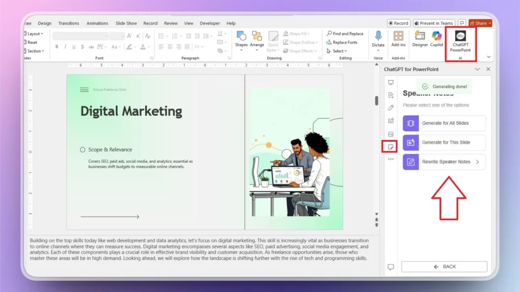
Notas de altavoz con Twistly
Generar notas de orador puede llevar horas porque tienes que recopilar datos y material de apoyo para cada diapositiva. Con Twistly, puedes generar notas de orador para una sola diapositiva o para toda una presentación en cuestión de segundos.
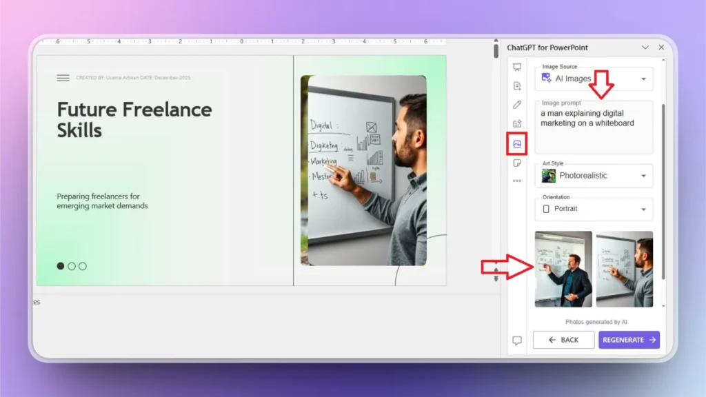
Imágenes personalizadas para diapositivas
Convertir una parte del contenido en una imagen también puede hacer que tus diapositivas estén libres de desorden. Twistly puede buscar imágenes relevantes en sitios de imágenes de archivo gratuitos, o puedes obtener imágenes personalizadas con un generador de imágenes AI integrado en Twistly.
Sólo tienes que escribir tu mensaje y Twistly generará automáticamente ideas de imágenes y sustituirá las imágenes o el texto existentes por elementos visuales personalizados.
Integrar funciones similares a ChatGPT en PowerPoint
Twistly no es sólo un diseñador de diapositivas normal, sino un ChatGPT personalizado para PowerPoint. Descarga la versión de prueba gratuita de Twistly y empieza a hacer presentaciones increíbles con AI. Haz clic en el siguiente enlace para solicitar tu versión de prueba gratuita de Twistly.
Crear PowerPoint
Diapositivas con IA
Cree presentaciones basadas en IA a partir de
cualquier mensaje, documento o vídeo


Conclusión
Elegir fuentes aptas para disléxicos como Open Dyslexic, Tahoma y Arial puede hacer que tus presentaciones sean más accesibles para todos. Céntrate en estos pequeños elementos de diseño y maximiza el impacto de tus presentaciones en un público diverso.
Estos cambios no sólo cumplen las normas de accesibilidad, sino que hacen que tu mensaje sea más claro, más sólido y más impactante. Para disfrutar de una experiencia de presentación de PowerPoint mejorada, descarga Twistly y disfruta de la libertad y la automatización de la IA para PowerPoint.

Empieza a hacer presentaciones con IA en segundos
Acceso instantáneo
Empieza a explorar inmediatamente todas las funciones de Twistly
Sin compromisos
No necesita tarjeta de crédito y puede cancelar en cualquier momento
Asistencia dedicada
Nuestro equipo está aquí para ayudarle en cada paso del camino durante su juicio.