If you’ve ever needed an infographic, you know just how difficult it can be to make them. Skilled designers made be able to use Adobe Photoshop or Illustrator to crank out an attractive and informational infographic in a short amount of time, but if you’re not one of them, you’re going to struggle.
Thankfully, you don’t have to settle for just those two programs for your infographic creation. While there isn’t a perfectly simple solution, there are options, including PowerPoint. We’ll show you how to create an infographic in PowerPoint that not only looks good but gets your info across clearly as well.
Figuring Out What Your Infographic Should Show
It might sound dumb and overly simple, but this should really be the first step. We’ll get into the actual creation in just a moment, but first, you need to nail down what needs to be shown in your infographic and the significance of that data.
If you don’t have a clear vision of your information structure, you’re going to struggle to create a design that shares it clearly. You’ll just end up dragging text boxes around for an hour.
So, ask yourself the following:
- How should the information I want to share be structured?
- What connections are there between individual data points?
- What are the questions I’m hoping to answer with this infographic?
Then, put it all together into a structure that makes sense. You’ll use that as the basis for organizing your infographic design elements.
Using PowerPoint Infographic Templates
Using an existing template is the easiest way to go about this, and you don’t have to have an eye for design at all. In fact, for many, this is probably the preferred method.
- Simply visit the Microsoft Create page.
- Select the PowerPoint icon, then Browse Templates.
- In the search bar on the following page, search Infographic.
From there, you’ll see tons of templates that you can use for your infographic. Just pick the one that you think fits your data the best. You’ll have to sort through some templates that stretch the definition of “infographic,” but keep an open mind. What may not look like an infographic at first glance could very well be the design that fits your data the most with a few small tweaks.
Creating a Custom PowerPoint Infographic
If none of those templates do the trick, or if you just need a small, simple infographic for one slide of your presentation, no problem. You can still create your own custom infographic. It’s just going to take more work and you’ll be somewhat left to your own devices regarding the design. But PowerPoint can help.
Step 1: Map It Out with Shapes, Not Words
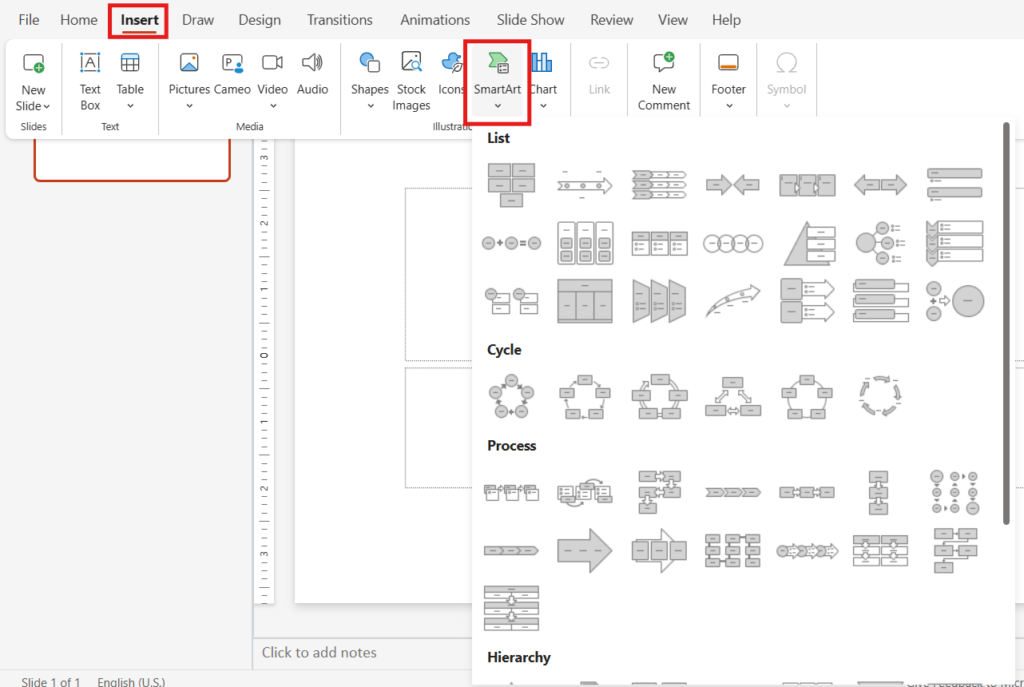
Start with shapes. Words come later. Use rectangles, circles, arrows and anything else that helps block out where content will go. PowerPoint’s Insert > Shapes is your best friend here.
You’re basically sketching with shapes. Like:
- A tall rectangle down the side = timeline
- A row of circles = steps in a process or key data points
- Arrows pointing = cause and effect
This is where PowerPoint’s Smart Art comes in handy. Just go to Insert >Smart Art and choose from the list of graphics available. Almost everything you’re likely to need in terms of shapes and connections can be found here. Better yet, it’s all organized for you so that if you need a timeline or a hierarchical dispay, you’ll know exactly where it is thanks to the Smart Art categories:
- List
- Cycle
- Process
- Hierarchy
- Timeline

Don’t worry about colors or alignment yet. This is just a rough draft. Think of it like scaffolding for the real content, which will be your data. When all the key parts are in place, you can make it pretty.
Step 2: Add Your Data
Once you have that basic structure in place, you can start putting your data in. You’ll probably make some tweaks along the way, but that’s fine.
Here’s the flow most infographics follow:
- Headline: What’s this about?
- Sections or Buckets: Usually 3 to 5, each with a mini-topic
- Stats, steps, or ideas: Ideally with a number, icon or simple graphic
- Call to action: What do you want the viewer to do with the information?
Drop those in one at a time. Don’t write long paragraphs. Don’t shrink the font just to fit more. Keep it simple and to the point. After all, this is an infographic, not an essay.
This is where you can also use icons. PowerPoint has them built-in (Insert > Icons). Icons do a lot of work visually where Smart Art or other basic shapes from step 1 fall short.
Step 3: Add Animations
Lastly, consider adding animations. You don’t have to add them, and they certainly can be distracting. BUT… if you plan to walk your audience through an infographic step by step, analyzing each data node, animations can keep you and your audience from getting ahead of yourself.
If you need a crash course on using animations in PowerPoint, check out our guide: How to Add Animations in PowerPoint
Create PowerPoint
Slides with AI
Build AI-powered presentations from
any prompt, doc, or video
That’s it, and it doesn’t have to be fancy. It just has to tell a story people can actually follow. Just remember to add colors that make sense but don’t go overboard. At the end of the day, a black and white infographic that clearly communicates information is much more effective than a rainbow-colored one that doesn’t.
Start Making AI Presentations in Seconds
Instant Access
Begin exploring Twistly’s full suite of features immediately
No Commitments
No credit card required, and you can cancel anytime
Dedicated Support
Our team is here to assist you every step of the way during your trial.


