

You can make your data and figures visually appealing with just a few clicks. PowerPoint is not just about images and shapes, but all other elements that make data representation effective and engaging. For example, you can insert a pie chart in PowerPoint to make it easier for audiences to process the information.
Add timelines, graphs, and infographics to your slides, not just pie charts. All you have to do is learn how to manipulate the different tools readily available in PowerPoint. Adding a graph in PowerPoint is easy, and only the editing part might take some time.
Making a Pie Chart in PowerPoint
Is making a pie chart in PowerPoint easy? Yes, with our detailed guide, you can easily add a chart or graph to the new presentation or the existing slides. Before inserting a pie chart in PowerPoint, let’s look at what a pie chart is.
What is a Pie Chart?
The concept of a pie chart is the same for PowerPoint as for other tools and programs. A simple pie chart is a circular graph with different slices representing different data sets. These charts make it easier for the presenter to demonstrate complex data in more understandable ways.
The largest slice in the pie chart shows the most important data, while the smaller size of the slice shows the lower value. If you show a chart of the best add-ins for PowerPoint, you can make the top-rated add-in the biggest slice. The size of the slices will keep decreasing based on the reviews.
Steps to Insert a Pie Chart in PowerPoint
In the latest versions of PowerPoint, when you click on a blank slide, you get different icons that make it easier to insert desired elements. However, for a more conventional approach for all versions of PowerPoint, here are the steps to make a pie chart for your presentation.
Step 1: Open your Presentation
Open your new or existing presentation and navigate to the slide where you want to add the pie chart.
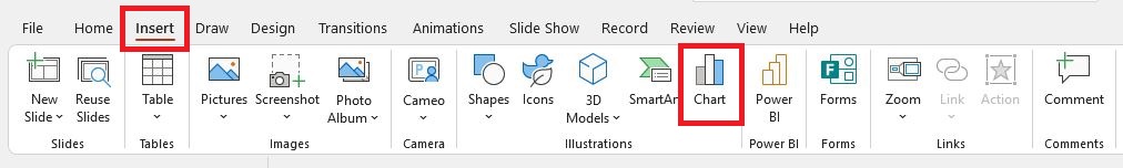
Step 2: Insert a Pie Chart into the Slide
Now, go to the Insert tab from the top menu and click on the Chart button from the Illustrations section.
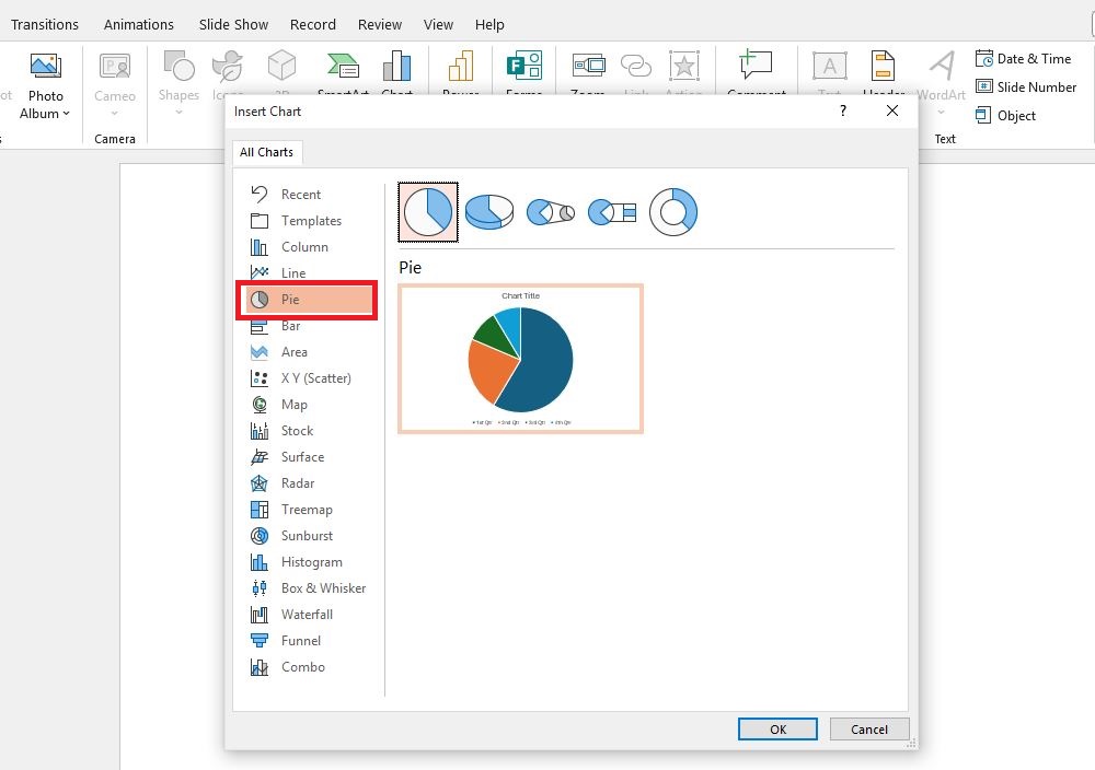
Step 3: Choose the Chart
Clicking on the Chart button will open a new pop-up from which you can select different elements. Navigate to Pie and then select the desired type of pie chart. Click Ok to insert the chart into the slide.
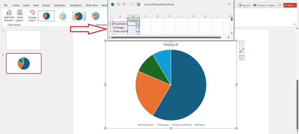
Step 4: Edit the Pie Chart
Edit the chart and enter your custom values to edit the pie chart. If the spreadsheet disappears, click on it and then click on the Edit Data button, and you will see the spreadsheet.
Customize a Pie Chart in PowerPoint
There are certain changes that you can make to customize a pie chart as per the theme of your presentation. Here are some quick edits and changes you can make to a pie chart in PowerPoint.
- Change chart style
- Apply chart filters
- Add or remove chart elements
- Change colors for different slices of the pie chart
- Edit data
- Adjust the chart layout
- Add data labels
- Highlight individual slices
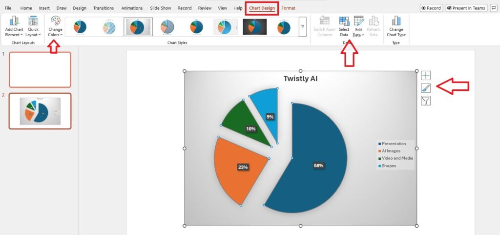
The Chart Design tab has all the elements related to customizing the pie chart in the presentation. You can change the chart to a graph or any other visual shape.
How to Add Visual Elements with AI?
Different PowerPoint templates are available for pie charts. These templates allow easy editing of the pie chart according to your custom values and data. Another option is to use AI to add different interactive visual items to presentation slides.
Create Charts with AI.
Build AI-powered presentations from
any prompt, doc, or video


Twistly AI for PowerPoint
Not every PowerPoint user is good at designing part of the presentation slides. For common users and experts, the Twistly add-in for PowerPoint offers advanced features that allow automatic graphic elements and shapes for the slides.
Making presentation slides with AI is easy with Twistly. Instead of making everything from scratch, you just have to choose any of the following options to create a presentation:
- Enter the topic of the slide
- Link to YouTube video
- Article or text
- Upload a Word or PDF document
Twistly will add the text for the slides, edit the template, and insert relevant graphics, charts, and other required elements to make your presentation more appealing.
We need to present an image on the topic “Comparison of Top Automotive Manufacturers” on Twistly. Here is what we got within a few moments of our presentation.
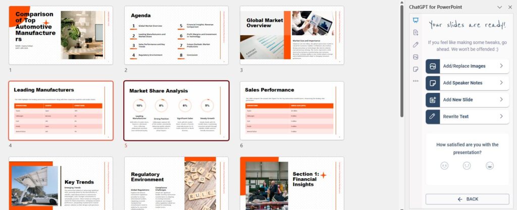
As you can see, these slides contain everything from text, images, and shapes to tables and graphical representations of the data. Without any manual edits, you get professional slides within seconds.
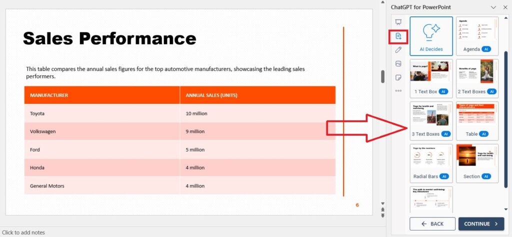
Edit Presentation with Twistly
Do you want to make changes to the output? All elements of this presentation are fully editable. You can manually change the slides or ask AI to do it.
Imagine you want to add a new slide to the presentation. Click on the Add a new Slide button, and you will see different options available to choose from. These quick action buttons make it easier for users to add any element to the slides.
Get Twistly for free for a limited time. We are proud of our product and want you to try it. Make PPTs with an AI presentation maker and be the most productive team member.
Conclusion
Use the Chart button to insert a pie chart in PowerPoint or Twistly AI to add visuals and shapes to your slides automatically. Always go for the quickest, easiest, and most accurate way to do things, and for PowerPoint presentations, that’s Twistly.
Frequently asked questions


Start Making AI Presentations in Seconds
Instant Access
Begin exploring Twistly’s full suite of features immediately
No Commitments
No credit card required, and you can cancel anytime
Dedicated Support
Our team is here to assist you every step of the way during your trial.