

If you think PowerPoint is just for slide decks, then think again. From event posters to research graphics, PowerPoint can help you build a full-size, printable poster without needing fancy design software. Here’s everything you need to know to make a poster in PowerPoint that looks polished, professional and pops.
Below, we’ve outlined some steps to follow if you’d like a simple process. We’ve also provided some tips that you can implement to really make your work stand out from the rest.
1. Set Your Canvas to Poster Size
Your first step is setting the slide size to match your poster printing dimensions. Go to Design > Slide Size > Custom Slide Size and enter the size you need (common sizes include 11″×17″, 18″×24″, or 24″×36″). PowerPoint maxes out at 56″×56″, so if you need something larger, design at half size and print at a blown up size.
2. Put the Grid to Work
Turn on View > Gridlines & Guides to create a structured layout. Use those guides to align your headers, content blocks, visuals and footer elements evenly. Good alignment is essential for a professional finish, and if you’re creating a poster that will be widely distributed, you want to make sure things are tightened up as much as they can be.
3. Choose a Simple Background
Go with a background that supports your content, not overshadows it. A solid color is generally safe and can look clean, but they aren’t always the way to go. Gradients add depth, while lightly textured images can personalize the look to align with your personality or a specific industry. Just make sure the text remains legible.
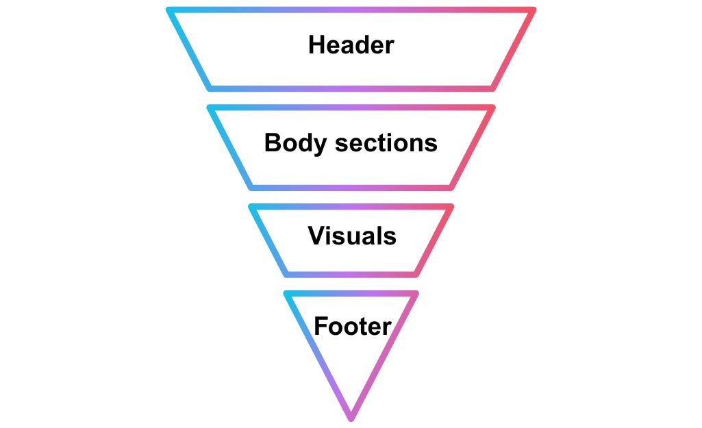
4. Plan Your Poster Structure
It can be helpful to think of your poster like a newspaper page. In that context, here are some considerations.
- Headline: big, bold and at the top
- Body sections: organized in columns or structured blocks
- Visuals: photos, charts and graphs
- Footer: logos, credits or contact info
Leave at least an inch of margin around the edges to prevent important information from getting cut off during printing.
5. Use Easy-to-Read Fonts
One thing to keep in mind, and which differs from the kind of slides you might usually create in PowerPoint, is that this all needs to be able to be read from a distance. With your usual PowerPoint slide, people are often looking at it on a computer screen from a foot away or blown up on a large projector. Since posters require readability from a distance, go with large, clear fonts.
- Title: 72–120 pt
- Headers: 40–80 pt
- Body text: 24–48 pt
Stick to two fonts maximum.
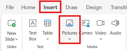
6. Insert High-Quality Visuals
Insert images using Insert > Pictures, not copy-paste… you really want to make sure you preserve the resolution. You’ll get the best print result with 300 dpi, but 150 dpi can work as well.
7. Fine-Tune Alignment & Grouping
After placing your elements, you’ll want to take some time to fine-tune everything. Details really matter here when it comes to printable materials.
- Align everything neatly using Format > Align.
- Group related items (like a chart and its title) so they stay together.
- Remove outlines from text boxes for a clean style.
- Maintain consistent spacing and visual flow.
8. Proof with a Close Zoom
Once you’re done laying things out, it’s time for one final inspection. Did we mention that the details really matter when it comes to printable materials? Because they do…
- Zoom in by 200% and scan for alignment issues or blurry elements. Your printed poster should look sharp even up close, and even small errors in this area will be obvious once printed.
- Proofread meticulously to catch typos or awkward phrasing.
9. Export Properly for Print
Export your poster as a PDF using File > Export > Create PDF/XPS Document, choosing “Standard (publishing online and printing).” This option preserves fonts, layout and image quality, perfect for sending to print shops if you go that route.
[Read more: How to Save a PowerPoint as a PDF]
Tips for Making Posters That Stand Out
Hold on… don’t go yet. The technical setup is one thing, but you also have to think about the visual impact. After all, the goal of a poster is to grab attention quickly, whether it’s on a bulletin board, at a research conference or displayed at an event. Here’s how to take your PowerPoint poster from good to great.
Use Contrast Intelligently
If your background is light, use dark text, and vice versa. Contrast helps with readability and ensures your message isn’t lost in the design. Avoid overly busy backgrounds that compete with your content.
Stick to a Color Palette
Limit your poster to 2 or 3 main colors, ideally ones that align with your brand or theme. Tools like Coolors or Adobe Color are super cool because they can help you find combinations that work well.
Highlight Key Info
Use bold headings or colored boxes to emphasize important takeaways. Think about what someone should remember after 10 seconds of scanning. Visual hierarchy matters. If you don’t understand this, search up “inverted pyramid.”
Add QR Codes or Short Links
If you’re short on space, a QR code can connect people to extra resources, like a full report, signup page or portfolio. Just make sure it’s high resolution and tested before printing.
Avoid Cramming
White space isn’t wasted space. Leave breathing room around blocks of text and images. A cluttered poster is harder to read and easy to ignore.
Create PowerPoint
Slides with AI
Build AI-powered presentations from
any prompt, doc, or video


PowerPoint isn’t just for slide decks. It’s also a robust poster design tool. By setting the right size, using guides keeping layouts clean and exporting properly, you can create stunning posters with ease.


Start Making AI Presentations in Seconds
Instant Access
Begin exploring Twistly’s full suite of features immediately
No Commitments
No credit card required, and you can cancel anytime
Dedicated Support
Our team is here to assist you every step of the way during your trial.