

PowerPoint isn’t really meant for project planning, but let’s be real… people use it anyway. Your boss doesn’t want to open Excel, and nobody’s logging into a project management tool just to check one deadline. They want a slide. That’s why folks end up trying to cram timelines into PowerPoint.
The problem is, a plain list of dates gets messy fast. You can’t tell what overlaps or when one team is supposed to hand off to another. That’s where a Gantt chart helps. It’s basically just bars on a timeline, but it makes the work look organized instead of chaotic.
Now, PowerPoint may not be designed for Gantt charts, but you can still use it for these purposes. We’ll show you how to make a Gantt chart in PowerPoint so that it looks nice, is easy to edit and can communicate effectively with teams.
Why Bother with a Gantt Chart in PowerPoint?
To put it simply, putting a Gantt chart in your PowerPoint makes you look like you’ve thought things through. Anytime you are discussing something that may require a timeline or handing off tasks between teams, you’ll want to use it.
A Gantt chart shows tasks stretched across a calendar, so at a glance you can tell who’s doing what and when. Consider this example… If your design work is supposed to end April 20 and development starts April 21, you can actually see that handoff. A bulleted list would never make that obvious. Communicating the same handoff in a bulleted list would require extra bullet points, more clutter and possible confusion.
Now, sure, real project teams might still use Jira, Asana or some other tracker. But the execs or clients you’re presenting to? They want a clean picture in a deck, not a messy screenshot from a project management tool. A simple Gantt chart slide is enough to get the point across.
Step 1: Decide the Scope of Your Gantt Chart
Before you open PowerPoint, think about what you actually need to show. Are you mapping a single project, or an entire quarter of tasks? Too many tasks on one slide, and it becomes unreadable. Usually, 5-10 main tasks are enough for a single slide. Include start and end dates for each, and make sure you know which tasks overlap.
Step 2: Set Up Your Timeline
In PowerPoint, you don’t need anything fancy. All you really need is just a horizontal line across the slide. This line will be your calendar. Then, divide it into units that make sense for your project: days, weeks or months. Add markers or small labels for the key dates. You now have the skeleton for your Gantt chart.
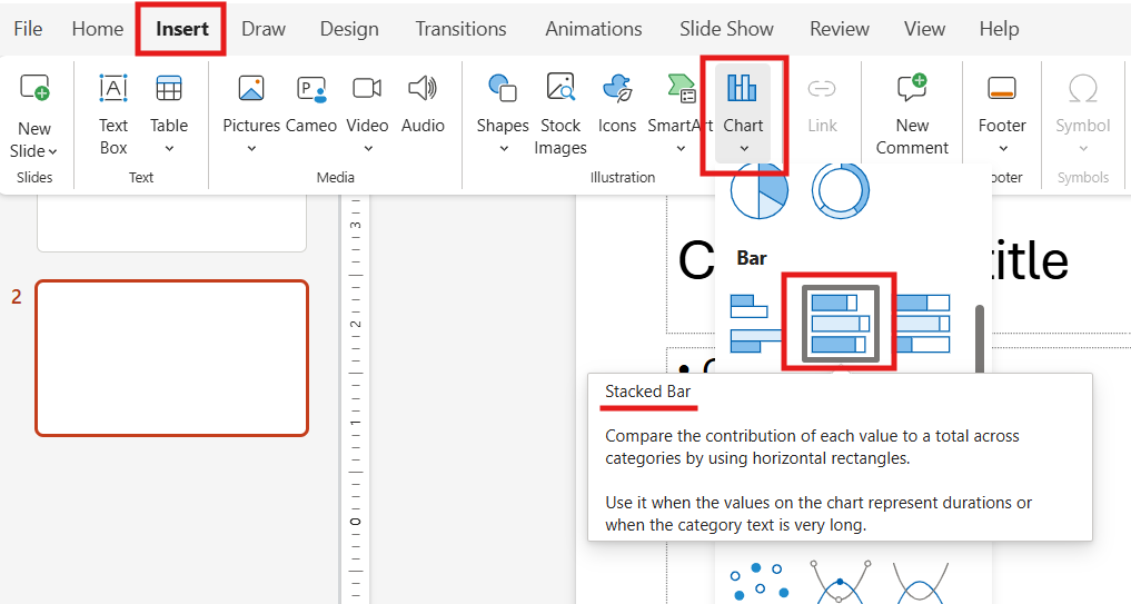
Now you probably don’t want to do this all by hand. Thankfully, you don’t have to. You can select Insert > Charts > Stacked Bar. You may be required to link an Excel document to do this. If you don’t have one, consider opting for one of the many pre-made templates available.
If you prefer, there is also a method using shapes and tables. Insert a table with tasks on the left and dates across the top. Fill cells corresponding to the task duration or use rectangles for bars aligned along a horizontal timeline.
Step 3: Add Task Bars and Color Coding
Now comes the visual part. Create bars for each task:
- If you’re using a stacked bar chart, this happens automatically.
- If you’re using shapes, draw a rectangle for each task starting at the task’s start date and ending at the finish.
Color-coding is critical. Assign colors by team, department or project phase. This makes your chart instantly easier to understand. For example, design tasks might be blue, development green and marketing orange. Just be sure to keep it simple and organized… no gradients.
Step 4: Add Labels and Details
Once your bars are in place, add text labels for tasks and teams. You can also include milestones, which are those critical points where something has to be done by a certain date. Use simple shapes like diamonds or small circles for these. Keep text concise. You want executives to glance at it and instantly understand the flow.
[More from Twistly: How to Create an Org Chart Using PowerPoint]
Step 5: Polish Your Slide
Now it’s time to make it readable. Align everything neatly, make sure colors are consistent and remove unnecessary clutter. Gridlines can help but remember, this isn’t your full project plan. It’s a visual summary.
Once you’ve built a Gantt chart you like, save the slide as a template. Next time, you can just swap out dates and tasks without starting from scratch. Over time, you’ll have a reusable set of visuals for any project update.
PowerPoint isn’t perfect for detailed project management, but it’s perfect for getting your point across quickly. A clean Gantt chart slide says: “I know what’s happening, and you can too.” And really, that’s half the battle when you’re presenting to anyone who isn’t living in the project weeds every day.
Create PowerPoint
Slides with AI
Build AI-powered presentations from
any prompt, doc, or video


Start Making AI Presentations in Seconds
Instant Access
Begin exploring Twistly’s full suite of features immediately
No Commitments
No credit card required, and you can cancel anytime
Dedicated Support
Our team is here to assist you every step of the way during your trial.