


You’ve likely heard the phrase, “You never get a second chance to make a great first impression.” As corny as it may be, it’s generally true. First impressions can be made in mere seconds, and color psychology can play a major role when it comes to making the right impression during your presentation.
Whether giving a presentation for school or work, color psychology can be a significant factor that determines how your audience perceives your slides. Some colors will be better suited for grabbing your audience’s attention and others might help influence them to sign a deal. No matter what your presentation is about or who you are presenting to, color combinations matter.
Color Psychology 101: What Colors Mean in Marketing
The use of color psychology is a technique that has been used in marketing for… well, we don’t really know how long, but we do know it’s been used for a really long time. And you don’t have to be doing any marketing work to take advantage of this technique.
Color psychology simply refers to what impact colors play on human emotions, perceptions and behaviors. What each color means for marketing applies to just about any subject matter. Let’s analyze each base color’s associated emotion/perception/behavior and how they can be used not only in marketing but for your PowerPoint presentations as well.
| Color | Emotion/Association | Presentation Tips |
| Red | Urgency, excitement, power | Great for CTAs, attracting attention or giving a “warning” |
| Blue | Trust, calm, professionalism | Use for corporate or health care presentations |
| Green | Growth, health, money | Perfect for finance, sustainability or wellness topics |
| Yellow | Optimism, energy, creativity | Can highlight key ideas (harsh on the eyes if used too much) |
| Black | Luxury, authority, elegance | Effective for premium branding or sleek product reveals |
| Purple | Creativity, innovation, mystery | Works well for tech, design or visionary content |
| Orange | Enthusiasm, affordability | Friendly and engaging for product demos or consumer pitches |
What are the Best Colors for Your Presentation?
With the knowledge above, it’s now time to consider how to use this theory of color psychology in your presentation slides. The information above is fairly basic, but you can build on it to create a slide palette that fits your PowerPoint goals.
Here are some other things to keep in mind when deciding which colors to use.
- High contrast improves legibility and attention.
- Dark backgrounds with light text work well in dark rooms.
- Light backgrounds with dark text work better for well-lit spaces.
- Avoid neon or overly saturated colors, as they can fatigue the eyes.
Before we go further, allow us to point out that our AI add-in, Twistly, can use ChatGPT to create your PowerPoint slides and offers numerous templates, each with a variety of color combinations. If you’re feeling a bit overwhelmed with the concept of color psychology, give our add-in a try.
Create PowerPoint
Slides with AI
Build AI-powered presentations from
any prompt, doc, or video


Best Color Schemes for Different Types of Presentations
As you can see, different color schemes will work for different presentation topics. Being able to strategically choose these colors is what will set your presentation apart from those that just look nice to those that truly influence your audience. Resist the urge to simply choose the colors that appeal to you and implement these color schemes instead.
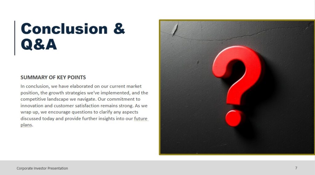
Color Scheme 1 – Corporate and Investor Presentations
Color Palette: Navy, charcoal, white, with teal or gold accents
Color Psychology Fit:
- Navy = trust and professionalism
- Charcoal = seriousness, sophistication
- Teal = calm innovation
- Gold = prestige and success
Where to Use the Colors:
- Background: Light gray or white
- Titles: Navy
- Accents/CTAs: Gold or teal
- Charts: Blue for neutral data, red for negative, green for growth
[Read more: Professional and Modern PowerPoint Templates for the Board Room and Beyond]
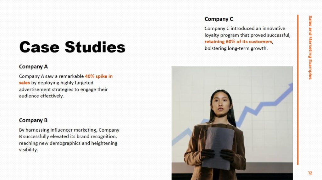
Color Scheme 2 – Sales and Marketing Presentations
Color Palette: White, dark gray, dark red or orange, lime green or sky blue
Color Psychology Fit:
- Red/orange = urgency and emotional triggers (CTAs)
- Lime green = energy, freshness
- Sky blue = optimism, trust
Where to Use the Colors:
- Background: White
- Titles: Dark red/dark gray
- CTAs: Bright red or lime green
- Accents: Orange for urgency, blue for trust
Color Scheme 3 – Medical or Science Presentations
Color Palette: White, soft green, light blue, navy or slate gray
Color Psychology Fit:
- Blue = stability, calm, trust
- Green = health and safety
- White = clarity and sanitation
- Navy/slate = credibility
Where to Use the Colors:
- Background: White or light blue
- Text: Navy or dark gray
- Data visuals: Green to indicate success/good health, red for health warnings
- Accents: Slate gray or light blue
Color Scheme 4 – Education and Training Presentations
Color Palette: Soft blue, light/dark gray, white, with warm yellow or light green accents
Color Psychology Fit:
- Blue = focus, reliability
- Gray/white = neutral space
- Yellow = energy and attention
- Green = calm, restorative
Where to Use the Colors:
- Background: Soft blue, light gray or white
- Text: Dark gray
- Accents: Warm yellow or light green
[Read more: How to Create an Employee Training Presentation Using AI]
Of course, there is at least one key instance when color psychology is less important, and that is when you need to adhere to a certain color scheme for branding purposes. If you work for a company whose primary brand color is red, you may be required to use more red in your presentation instead of other hues. It might also mean that red may not stand out in your CTAs in the same way as it might otherwise.
Where to Use Color Psychology in PowerPoint Slides
If you are in a situation where you may not have the freedom to choose a full color scheme, it can be helpful to know what colors best work for which elements in your slides. That way, you can implement color psychology wherever you’re able. Here is our recommendation, while keeping the theory of color psychology in mind.
| Slide Element | Best Use of Color | Psychological Influence |
| Background | Neutral tones (white, gray, navy, soft blue) | Low distraction, creates focus for foreground content |
| Text | Bold brand color or dark neutral (black, navy or dark gray) | Draws attention without distraction. Use bolder colors for titles. |
| Call-to-Action | Bright, warm colors (red, orange, lime green) for buttons or bolded CTA text | Creates urgency or excitement |
| Data visuals | Strategic color coding, such as green for positive, red for negative and blue for neutral | Reinforces meaning and enhances how people interpret data trends |
| Icons/Other visuals | Yellow, teal, gold or another accent color that fits your palette | Use to direct focus to different ideas |
As you can see, color is not just a design choice. It’s a strategy. Color psychology can play a key role in how your presentation slides are perceived, so try to choose the colors that best meet your goals.


Start Making AI Presentations in Seconds
Instant Access
Begin exploring Twistly’s full suite of features immediately
No Commitments
No credit card required, and you can cancel anytime
Dedicated Support
Our team is here to assist you every step of the way during your trial.